Red Purple Donut Chart – Visualized Data
RJ0600076_11
- Last Update 07/10/2025
- File Size 0.5MB
- # of Slides 2
- File Format PPTX
- Slide Ratio 16:9
- Color
Keywords
About the Product
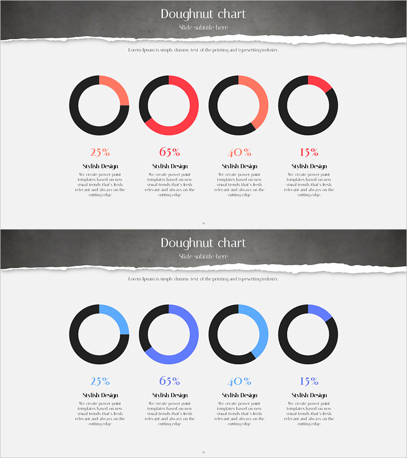
A donut chart PowerPoint slide that visualizes the proportion of four data categories using a red and blue two-tone color scheme. The design features black base rings with red or blue accent colors to clearly represent each item's composition ratio. The 2-slide set provides identical layouts with color variations, ensuring consistent data visualization throughout your presentation. Supports flexible percentage inputs (25%, 65%, 40%, 15%, etc.) with dedicated description text areas below each chart, making it immediately applicable to business reports, marketing materials, and investor presentations.
Usage Points
-
Main Usage
Designed to compare composition ratios across four categories such as market share, customer segments, sales distribution, or budget allocation at a glance. The hollow center of the donut chart allows you to add key metrics or titles, enhancing information delivery efficiency.
-
How to Use
Modify the ring colors and proportions of each donut to input your actual data. Add category names and descriptions in the text areas below each chart. Select between the two color-variant slides to match your presentation's visual tone.
-
Recommended For
Ideal for marketing team presentations, sales reports, executive performance briefings, client proposals, financial analysis documents, and any business presentation requiring data-driven decision-making support.
-
Slide Structure
Four donut charts arranged horizontally, each with a black base ring and either red or blue accent color. The layout consists of a title area at the top, four centered donut charts in the middle, and description text areas at the bottom.
Related Products
-

Red Blue Double Bar Graph – Data Visualization
#Graph
-

Donut Chart: Nutrient Ratio by Ingredient – Simple and Intuitive Representation
#Product/Service Introduction #Graph #Features
-

Abstract Pattern Area Chart Template – Distinctive Data Visualization
#Market and Competitor Analysis #Graph #Other
-

Two Pie Charts with Commentary – Market Share Analysis
#Market and Competitor Analysis #Graph #Market Status
