Bar Chart of Coffee Exports – Comparison and Performance
RJ0600075_6
- Last Update 07/10/2025
- File Size 3MB
- # of Slides 2
- File Format PPTX
- Slide Ratio 16:9
- Color
Keywords
- #Content-Based Slides
- #Design-Based Slides
- #Business Strategy
- #Market and Competitor Analysis
- #Graph
- #Achievements
- #Competitive Advantage
- #Horizontal Bar
- #Horizontal Bar Chart
- #16:9
- #horizontal bar chart PowerPoint
- #bar graph slide template
- #export volume comparison chart
- #country data visualization
- #performance comparison PowerPoint slide
About the Product
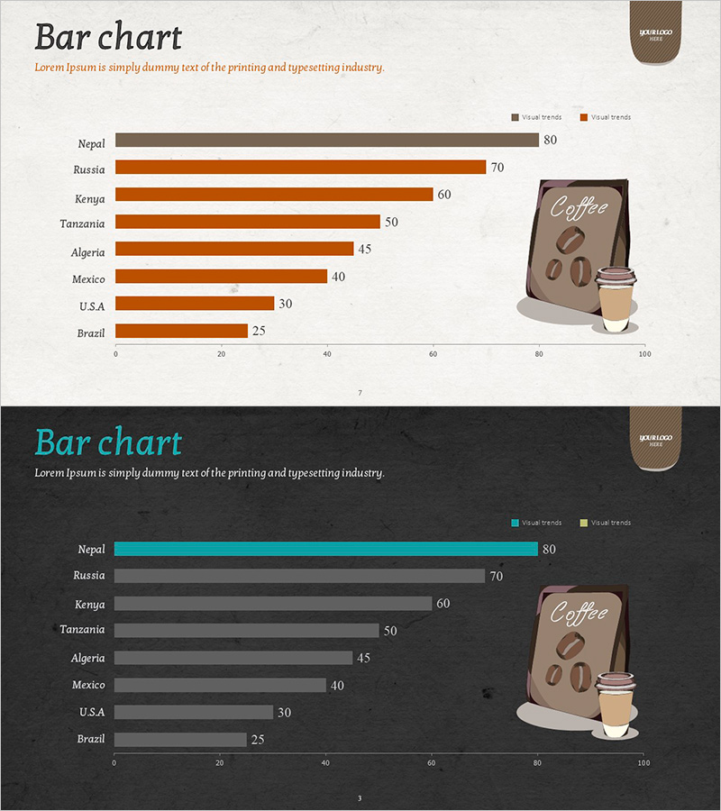
A horizontal bar chart PowerPoint slide comparing coffee export volumes across 8 countries with clear data visualization. The design features a light beige background with brown and orange color gradients representing two data series (actual performance and trends). Each country bar is labeled with precise numerical values, and the 0–100 scale axis ensures accurate comparison. This presentation template is ready to use in business reports, market analysis presentations, and export performance reviews for immediate integration into your slides.
Usage Points
-
Main Usage
Communicate international trade volumes, market performance, and country-by-country comparative analysis with numerical precision. Bar length enables intuitive size comparison while numerical labels enhance information credibility and decision-making clarity.
-
How to Use
Integrate into business reports, marketing presentations, investor briefings, and market analysis talks to compare export performance by country, sales volume, or market share. Edit existing data fields directly and customize bar colors and quantities as needed for your presentation context.
-
Recommended For
Export/import managers, marketing strategists, executives, and international business professionals presenting country-level performance comparisons, market landscape analysis, and competitive benchmarking. Ideal for quantitative data-driven decision-making materials and stakeholder communications.
-
Slide Structure
Eight horizontal bars representing countries (Nepal, Russia, Kenya, Tanzania, Algeria, Mexico, U.S.A, Brazil) arranged vertically. Two data series distinguished by color (brown for actual, orange for trend), with a 0–100 horizontal axis scale and right-aligned numerical labels for precise comparison.
Related Products
-

Horizontal Bar Graph of Component Analysis Results
#Business Strategy #Market and Competitor Analysis #Graph
-

Performance Analysis of the Second-Ranked Item – Towards Successful Strategies
#Business Strategy #Market and Competitor Analysis #Graph
-

Bar Chart Analysis of Gardening Activities Trend – Performance and Competitive Advantage
#Business Strategy #Market and Competitor Analysis #Diagram
-

Eco-friendly Icon Bar Graph – Effective Visualization for Market Analysis
#Business Strategy #Market and Competitor Analysis #Graph
