Bar Chart Visualizing Coffee Preference Survey Results
RJ0600003_10
- Last Update 06/21/2025
- File Size 4.5MB
- # of Slides 2
- File Format PPTX
- Slide Ratio 16:9
- Color
Keywords
- #Content-Based Slides
- #Design-Based Slides
- #Business Strategy
- #Market and Competitor Analysis
- #Graph
- #Achievements
- #Competitive Advantage
- #Horizontal Bar
- #Horizontal Bar Chart
- #16:9
- #horizontal bar chart PowerPoint
- #bar graph presentation slide
- #data comparison chart
- #survey results visualization
- #how to create bar chart in PowerPoint
About the Product
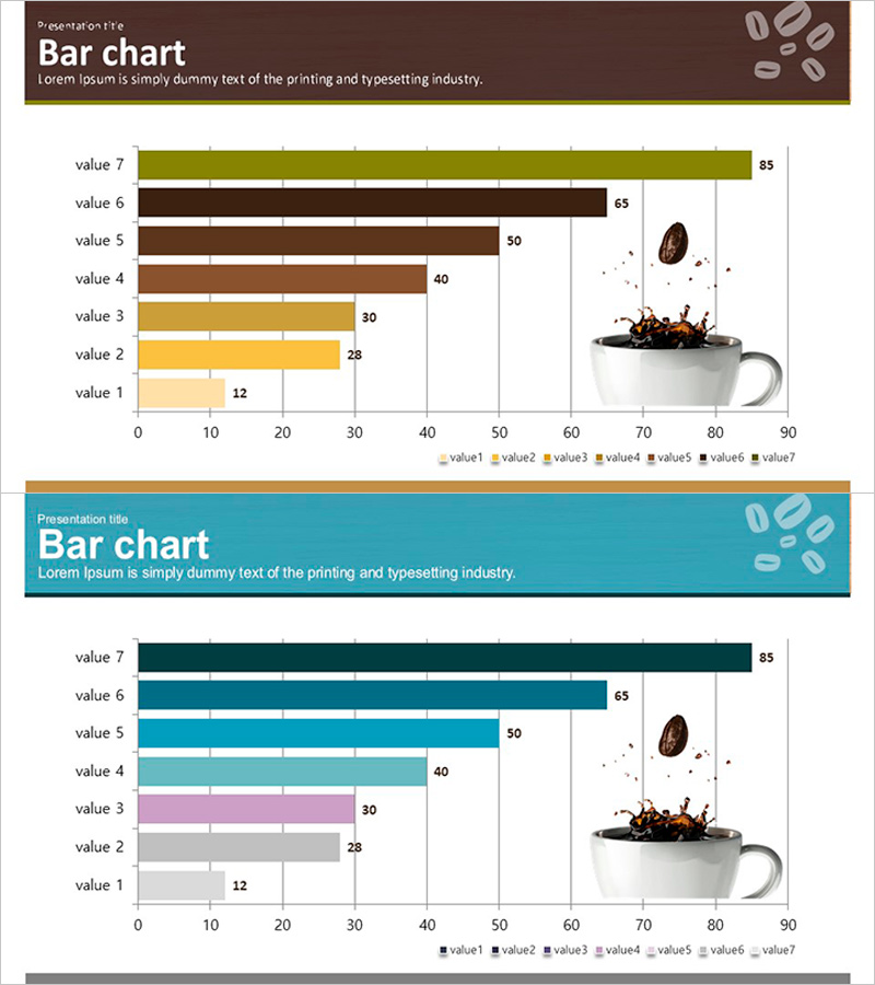
A horizontal bar chart PowerPoint slide visualizing coffee preference survey results with 7 data items. The design combines warm olive, brown, and yellow tones with a coffee cup image, making it ideal for product-related presentations. Each bar includes numeric labels, and a legend clearly distinguishes data series. Two slide layouts are provided: the first features brown tones, and the second uses teal tones, allowing you to select based on your presentation style. Perfect for market analysis, consumer research, product comparisons, and other quantitative data presentations. Fully editable slides ready for immediate use.
Usage Points
-
Main Usage
This graph slide is optimized for comparing and ranking quantitative data horizontally. Seven data items can be compared at a glance, with bar length and color intuitively conveying relative size differences. Ideal for market research, consumer preference surveys, sales comparisons, satisfaction ratings, and other quantitative data presentations.
-
How to Use
Enter data values in the slide master and bar lengths adjust automatically. Customize item names and numeric labels to match your survey results. Choose between two color schemes (brown or teal) to align with your presentation theme and tone. The legend clearly identifies each data series.
-
Recommended For
Marketing professionals and planners presenting consumer survey findings, sales teams explaining product comparisons, executives analyzing market conditions. Suitable for beverage and food industry presentations, consumer goods market analysis reports, academic presentations, and consulting proposals.
-
Slide Structure
Two-slide layout. Each slide contains a horizontal bar chart with 7 items (value 1–7), featuring a horizontal axis ranging 0–90 and item names on the vertical axis. The first slide uses olive, brown, and yellow tones; the second uses teal, pink, and gray tones for multi-series bars. Numeric labels appear at the end of each bar, with a legend at the bottom distinguishing all seven data series.
Related Products
-

Bar Chart of Coffee Exports – Comparison and Performance
#Business Strategy #Market and Competitor Analysis #Graph
-

Eco-friendly Icon Bar Graph – Effective Visualization for Market Analysis
#Business Strategy #Market and Competitor Analysis #Graph
-

Performance Analysis of the Second-Ranked Item – Towards Successful Strategies
#Business Strategy #Market and Competitor Analysis #Graph
-

Horizontal Bar Graph of Component Analysis Results
#Business Strategy #Market and Competitor Analysis #Graph
