Infographic Slide Showing Coffee Consumption Percentage
RJ0600075_14
- Last Update 07/10/2025
- File Size 3MB
- # of Slides 2
- File Format PPTX
- Slide Ratio 16:9
- Color
Keywords
- #Content-Based Slides
- #Design-Based Slides
- #Operational Plan
- #Market and Competitor Analysis
- #Other
- #Capital Investment Plan
- #Market Share
- #16:9
- #coffee consumption ratio PowerPoint slide
- #market analysis infographic slide
- #US map PowerPoint template
- #regional data visualization presentation
- #competitive analysis slide
About the Product
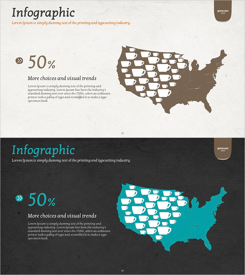
A data visualization PowerPoint slide featuring a US map-based infographic showing coffee consumption percentages by state. Includes two color scheme versions: beige-brown and teal-dark backgrounds, with coffee cup icons representing consumption levels across regions. Left-aligned text area displays 50% metric and descriptive content, enabling clear market analysis presentation. Ideal for competitive analysis, market share comparison, and operational planning presentations where regional consumption trends need visual emphasis.
Usage Points
-
Main Usage
Visualize regional and market-specific consumption data using map-based infographic format for market analysis and competitive landscape presentations. Geographic distribution representation enables intuitive understanding compared to raw statistics, supporting data-driven decision-making.
-
How to Use
Insert into market overview, competitive analysis, or regional opportunity sections of investor presentations, business plans, and marketing strategy documents. Apply beige version for traditional presentation tone and teal version for contemporary design aesthetic to maintain visual consistency.
-
Recommended For
Marketing teams presenting market analysis, executive reports requiring competitive benchmarking, business development teams analyzing regional demand, and investor relations teams showcasing market opportunities in pitch decks.
-
Slide Structure
Two-slide set with each slide divided into left text area (metrics, title, description) and right map visualization section. US regional map with icon-based data representation enables easy state-by-state comparison, with ample text space for additional insights or supplementary information.
Related Products
-

Charge Shape Circle Graph for Visualizing Data Analysis – Effective Market and Competitor Analysis
#Product/Service Introduction #Market and Competitor Analysis #Graph
-

Proportional Graph by Meat Part – Market Analysis Insights
#Market and Competitor Analysis #Diagram #Graph
-

Donut Chart in Overseas Markets – Market Share Analysis
#Market and Competitor Analysis #Graph #Other
-

Tennis Athletic Zone Chart – Market Share and Forecast
#Market and Competitor Analysis #Graph #Other
