Trends in Usage by Transportation Type – Market Trend Analysis
RJ0800029_7
- Last Update 08/08/2025
- File Size 0.4MB
- # of Slides 2
- File Format PPTX
- Slide Ratio 16:9
- Color
Keywords
- #Content-Based Slides
- #Design-Based Slides
- #Market and Competitor Analysis
- #Graph
- #Other
- #Market Share
- #Industry Trends
- #16:9
- #transportation usage trends PowerPoint slide
- #market trend analysis presentation
- #line chart PPT slide
- #market analysis presentation
- #competitive analysis PowerPoint template
About the Product
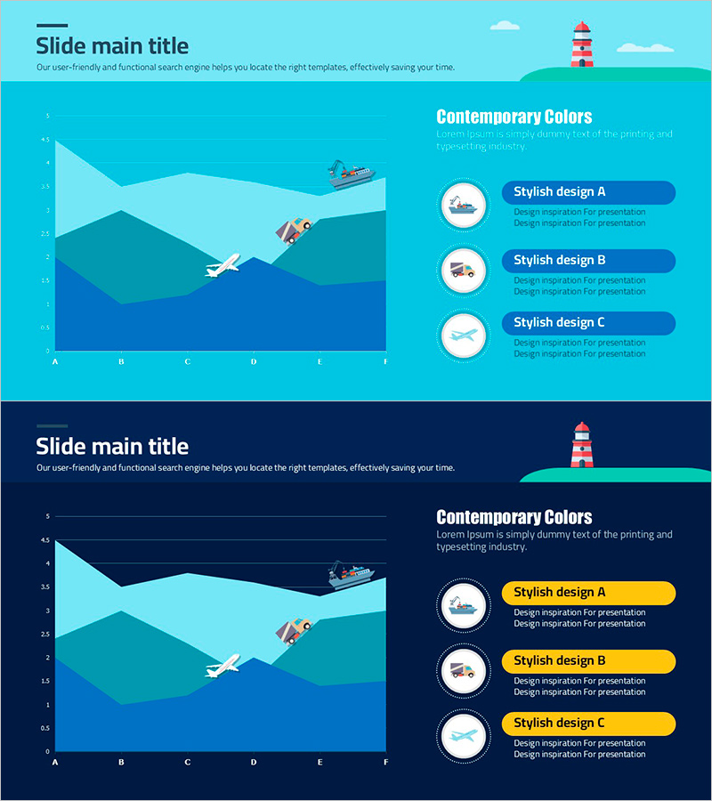
A PowerPoint slide that visualizes transportation usage trends across different modes of transport over time. The slide features a line chart on the left showing usage patterns across six time intervals, with three design style options presented on the right with accompanying icons. The turquoise background with white typography ensures strong readability and visual hierarchy. The layout divides the slide into two sections: a title area at the top, a multi-line chart on the left displaying comparative trends, and three selectable options on the right. This presentation slide is ready for immediate use in market analysis, competitive analysis, and market share comparison presentations.
Usage Points
-
Main Usage
Effectively communicate transportation usage patterns across different modes and time periods to decision-makers. The multi-line chart format enables simultaneous comparison of multiple transportation types, making it ideal for market analysis, competitive benchmarking, and industry trend presentations.
-
How to Use
Input actual usage data into the left-side line chart to represent transportation mode usage by month, quarter, or year. Add key insights or strategic options to the three choice areas on the right to support audience decision-making. Modify chart legends and axis labels to match your data, then the slide is ready for presentation.
-
Recommended For
Market analysts, executives, strategy planning teams, consultants, and industry research professionals presenting market trend reports, competitive analysis findings, business strategy meetings, and investor presentations. Particularly valuable for transportation, logistics, energy, and tourism industries analyzing usage trend comparisons.
-
Slide Structure
Title section at top (main title + subtitle), left section with line chart (6 time intervals on X-axis, 5-level Y-axis, 3 data lines), and right section with three icon-labeled choice options and text boxes. The balanced layout between data visualization and strategic options enables simultaneous presentation of analytical findings and decision alternatives.
Related Products
-

Segmented Vertical Bar Graph for Automotive Market Trends
#Market and Competitor Analysis #Graph #Other
-

Construction Business Trend Graph of Office Buildings – Essential Template for Market Analysis
#Market and Competitor Analysis #Graph #Market Share
-

Halloween Hats and Pumpkin Charts – Ideal for Market Analysis
#Market and Competitor Analysis #Graph #Other
-

Donut Chart Slide Visualizing Target Market Development Status
#Market and Competitor Analysis #Graph #Other
