Animal Natural Environment Improvement Rate Future Outlook Horizontal Bar Chart
RJ0600074_11
- Last Update 07/09/2025
- File Size 3MB
- # of Slides 2
- File Format PPTX
- Slide Ratio 16:9
- Color
Keywords
- #Content-Based Slides
- #Design-Based Slides
- #Market and Competitor Analysis
- #Graph
- #Industry Trends
- #Horizontal Bar
- #Segmented Horizontal Bar
- #16:9
- #100% stacked horizontal bar chart
- #stacked bar chart PowerPoint
- #data comparison slide template
- #environmental improvement rate graph
- #time series visualization
- #how to create stacked bar chart in PowerPoint
About the Product
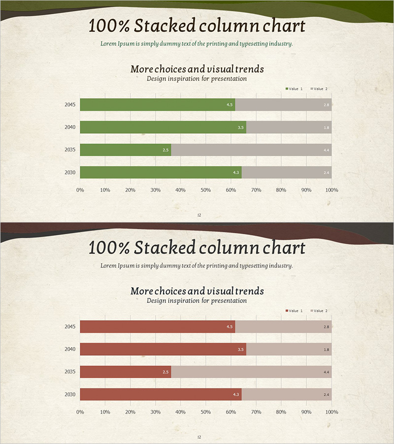
A 100% stacked horizontal bar chart PowerPoint slide designed to visualize animal, natural, and environmental improvement rates with future outlook projections. This 2-slide set features green and burgundy color themes, displaying data across 4 years (2045, 2040, 2035, 2030) with 2 data series represented as proportional segments. Numeric labels are embedded in each bar segment for precise ratio communication in presentations, reports, and strategic proposals. Available in 16:9 widescreen PPTX format, fully editable and ready to customize with your own data.
Usage Points
-
Main Usage
Simultaneously compare year-over-year environmental improvement trends and the compositional ratio of two data series. The 100% stacked format clearly shows the relative proportion of each component against the total, enabling stakeholders to quickly identify temporal patterns and performance shifts.
-
How to Use
Ideal for environmental policy reports, sustainability presentations, wildlife conservation proposals, natural resource management briefings, and ESG communications. The 2-slide format allows you to select or combine color themes to match your presentation context and organizational branding.
-
Recommended For
Environmental policy specialists, ecological researchers, sustainability planning teams, wildlife conservation organizations, natural resource managers, ESG report authors, environmental consultants, and government agencies presenting data-driven environmental initiatives and conservation outcomes.
-
Slide Structure
Each slide contains a title and subtitle area paired with a 100% stacked horizontal bar chart. Four years (2045, 2040, 2035, 2030) are positioned on the Y-axis, while the X-axis spans 0–100% with two data series (Value 1 and Value 2) color-coded for distinction. Numeric labels appear within each bar segment for accurate ratio verification and audience comprehension.
Related Products
-

Analyzing Flower Horizontal Segmentation Charts – Understanding Market Trends
#Market and Competitor Analysis #Graph #Industry Trends
-

Visualizing Camping Business Market Share with Bar Chart
#Market and Competitor Analysis #Graph #Industry Trends
-

World Travel Template Horizontal Bar Segment Chart
#Market and Competitor Analysis #Graph #Industry Trends
-

Plant Horizontal Bar Chart – Understand Market Trends
#Market and Competitor Analysis #Graph #Market Analysis
