The Jumping Boys and Bell Charts - Data Visualization for Market Analysis
RJ0600071_18
- Last Update 07/09/2025
- File Size 2.1MB
- # of Slides 2
- File Format PPTX
- Slide Ratio 16:9
- Color
Keywords
- #Content-Based Slides
- #Design-Based Slides
- #Market and Competitor Analysis
- #Graph
- #Market Analysis
- #Competitive Advantage
- #Line
- #Line Chart
- #16:9
- #bell curve chart PowerPoint
- #distribution curve slide template
- #data visualization PowerPoint
- #market analysis chart
- #trend analysis slide
- #how to create bell curve in PowerPoint
About the Product
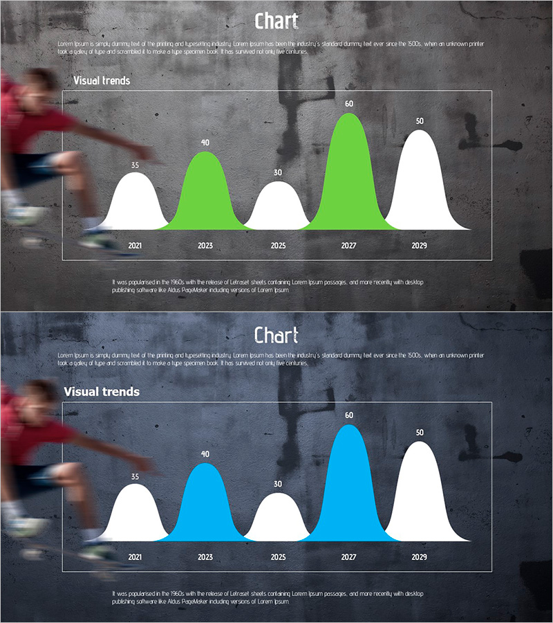
A professional bell curve chart PowerPoint slide designed for market analysis and competitive positioning presentations. This 2-slide template visualizes 5-year data (2021–2029) with dual color options: lime green and white, or sky blue and white. Each year's data point (35, 40, 30, 60, 50) is represented as a bell-shaped distribution curve, making peak periods and trend changes immediately apparent. The 16:9 widescreen PPTX format is fully editable and ready for use in marketing plans, business reports, investor pitches, and strategic presentations. The background features subtle business imagery for a professional aesthetic.
Usage Points
-
Main Usage
Visualize year-over-year data trends such as market analysis, sales performance, customer satisfaction, or market share using bell-shaped distribution curves. Enables executives, investors, and stakeholders to identify peak periods and overall trajectory at a glance, supporting data-driven decision-making in strategic planning and investor relations.
-
How to Use
Edit data values and year labels directly in the slide master to match your analysis results. Choose between lime green or sky blue accent color versions to align with corporate branding. Add custom chart titles and descriptive text to clarify presentation context and key insights.
-
Recommended For
Marketing managers, business strategists, financial analysts, executive presenters, investor relations professionals, and management consultants presenting market analysis, sales metrics, customer trends, or performance benchmarks.
-
Slide Structure
Two-slide layout with the first slide featuring lime green accent color and the second featuring sky blue accent color. Both slides display a 5-point bell curve representing data from 2021, 2023, 2025, 2027, and 2029. Subtle business background imagery creates professional context while maintaining focus on the data visualization.
Related Products
-

Analysis Graph of Young and Old Age Groups – Market and Competitive Insights
#Market and Competitor Analysis #Graph #Other
-

Brown Blue Detailed Analysis Chart - Market and Competitor Analysis
#Market and Competitor Analysis #Diagram #Graph
-

Bell Charts for Various Topics – Market Competition Analysis
#Market and Competitor Analysis #Graph #Market Analysis
-

Line Chart of the Violence Survey – Market Analysis and Competitive Advantage
#Market and Competitor Analysis #Graph #Market Analysis
