Bell Charts for Various Topics – Market Competition Analysis
RJ0500007_17
- Last Update 06/09/2025
- File Size 1.3MB
- # of Slides 2
- File Format PPTX
- Slide Ratio 16:9
- Color
Keywords
About the Product
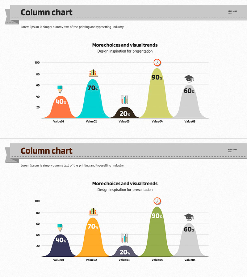
A 2-slide PowerPoint template visualizing 5 data points using bell curve distribution. Features vibrant color schemes including orange, cyan, black, lime, and gray to represent proportional values and distribution trends. Ideal for market competition analysis, customer satisfaction surveys, sales performance comparisons, and other business data presentations. Provided in 16:9 widescreen PPTX format with fully editable elements. Customize numerical values, labels, and colors to match your specific data requirements.
Usage Points
-
Main Usage
Visualize distribution trends and proportional relationships across 5 data categories using bell curve representation. Effectively communicate market competition scenarios, customer satisfaction distribution, sales performance metrics, and other quantitative insights. Percentage values displayed above each curve ensure precise data communication.
-
How to Use
Apply to corporate strategy presentations, marketing reports, and market analysis decks in the data visualization section. Edit numerical values, labels, and colors to match your dataset and use immediately in presentations. Two color scheme variations included to match different presentation themes and corporate branding.
-
Recommended For
Marketing professionals, executives, data analysts, consultants, and business strategists who need to present quantitative data. Particularly effective for illustrating market share distribution, competitive positioning, customer segmentation, and sales channel analysis.
-
Slide Structure
2-slide set featuring bell curve distribution charts with 5 data points each. First slide uses orange, cyan, black, lime, and gray color palette; second slide provides alternative color combination. Each curve includes percentage labels and supporting icons to enhance data interpretation.
Related Products
-

Analysis Graph of Young and Old Age Groups – Market and Competitive Insights
#Market and Competitor Analysis #Graph #Other
-

Line Chart of the Violence Survey – Market Analysis and Competitive Advantage
#Market and Competitor Analysis #Graph #Market Analysis
-

Forest Construction Graphs and Strategies – Sustainable Competitive Advantage
#Market and Competitor Analysis #Graph #Market Analysis
-

Line Chart for Visualizing Data Changes – Effective Information Delivery
#Market and Competitor Analysis #Graph #Market Analysis
