Pie Chart with 3 Topics – Visual Trends
RJ0600071_12
- Last Update 07/08/2025
- File Size 2MB
- # of Slides 2
- File Format PPTX
- Slide Ratio 16:9
- Color
Keywords
About the Product
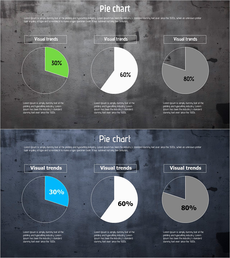
A 2-slide PowerPoint presentation set featuring three pie charts displaying data ratios across different categories. The slides showcase lime green, white, and gray color combinations with varying percentages (30%, 60%, 80%) to represent composition, market share, or categorical distribution. Each slide includes 'Visual trends' labels and descriptive text areas for customization. Designed in 16:9 widescreen format (PPTX), these pie chart slides are ready for immediate editing and integration into business reports, quarterly presentations, marketing analysis decks, and strategic planning meetings.
Usage Points
-
Main Usage
Visualize data composition, market share, and categorical distribution using pie charts to communicate numerical insights clearly to audiences. Ideal for quarterly business reports, marketing analysis presentations, sales performance reviews, and strategic planning sessions where percentage-based data needs visual emphasis.
-
How to Use
Double-click each pie chart segment to edit data values and percentages. Modify the 'Visual trends' labels and descriptive text to match your content. Adjust colors as needed to align with corporate branding guidelines. Save and export as PDF or video presentation format for seamless delivery.
-
Recommended For
Finance teams presenting quarterly earnings, marketing departments analyzing customer segmentation, sales teams reporting regional performance, executives preparing strategy briefings. Also suitable for academic presentations, research data visualization, and student thesis defenses requiring ratio-based charts.
-
Slide Structure
2-slide set with identical layout structure. Each slide displays 3 pie charts arranged horizontally: first chart in lime green (30% segment), second in white (60% segment), third in gray (80% segment). Each chart includes a 'Visual trends' header label and descriptive text block below for context and explanation.
Related Products
-

User Analysis Graph by Age Group – Advanced Data Insights
#Market and Competitor Analysis #Diagram #Graph
-

Pie Chart and Detailed Explanation – Visualizing Market Share
#Market and Competitor Analysis #Graph #Market Share
-

Horizontal Bar Graphs and Analysis – Market and Competitor Analysis
#Market and Competitor Analysis #Graph #Competitive Advantage
-

Weather Area Chart – Market Trend Analysis
#Market and Competitor Analysis #Graph #Other
