Blue Green Basic Line Chart – Visualizing Data
RJ0600069_31
- Last Update 07/08/2025
- File Size 4.7MB
- # of Slides 2
- File Format PPTX
- Slide Ratio 16:9
- Color
Keywords
About the Product
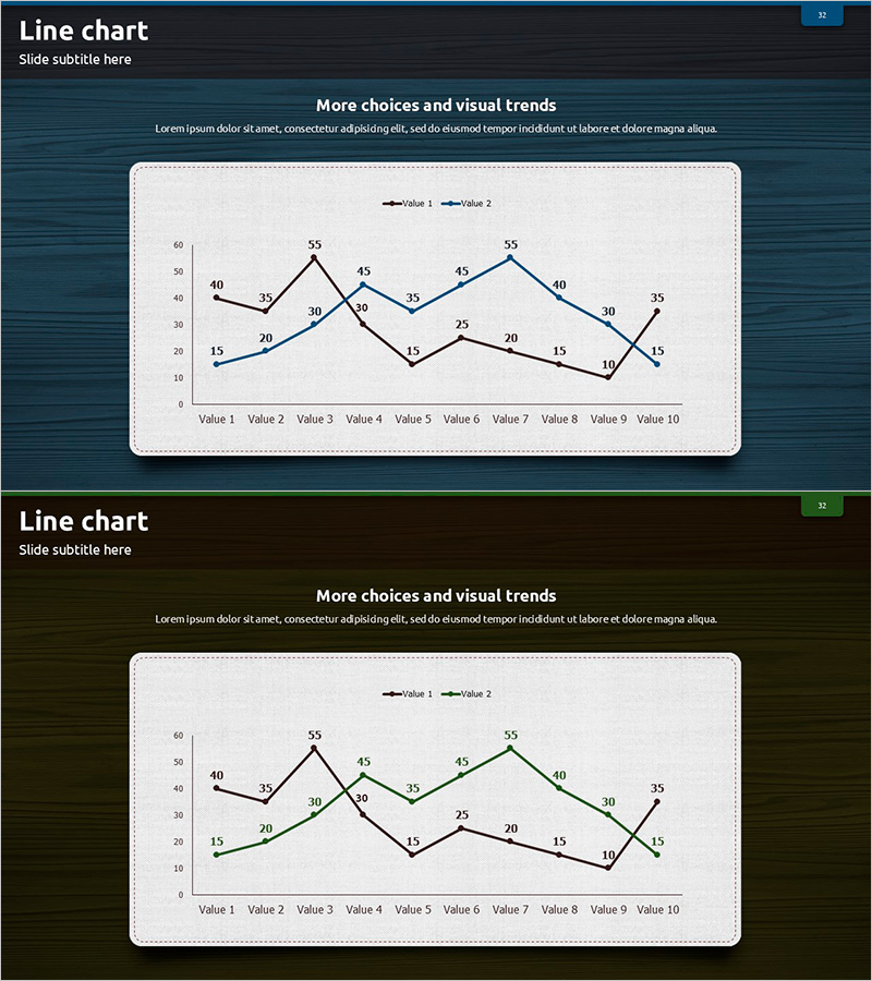
A dual-series line chart PowerPoint slide designed to track and compare two data trends simultaneously. The blue and green line series clearly distinguish between datasets across 10 data points, with each value labeled for precision. Formatted in 16:9 widescreen with 2 slides, this presentation template is ready for business reports, performance analysis, quarterly reviews, and comparative trend analysis. Ideal for visualizing correlations between metrics such as revenue vs. cost, planned vs. actual, or year-over-year comparisons.
Usage Points
-
Main Usage
Designed to compare two related metrics over time, revealing trends and correlations at a glance. Ideal for financial analysis, performance tracking, competitive benchmarking, and KPI monitoring where simultaneous comparison of two datasets is essential for decision-making.
-
How to Use
Double-click the chart to enter edit mode and modify data values directly. Update axis labels and legend text to match your metrics. Customize line colors and styles through the chart formatting options. Adjust the Y-axis scale to fit your data range. All elements are fully editable and compatible with PowerPoint's native chart tools.
-
Recommended For
Financial analysts, marketing managers, project managers, and business intelligence professionals presenting quarterly results, budget vs. actual analysis, or competitive performance metrics. Suitable for consulting firms, financial institutions, manufacturing companies, and corporate strategy presentations requiring dual-metric comparison.
-
Slide Structure
Two slides with identical layout: title area at top and dual-series line chart below. Each chart displays 10 data points (Value 1 through Value 10) on the X-axis, Y-axis range 0–60, with blue and green line series, legend, and data point labels. Fully customizable for different datasets and metrics.
Related Products
-

Presentation Template for Operation Planning and Risk Management
#Operational Plan #Risk Management and Regulatory Compliance #Graph
-

Mokup and Turnout Analysis Chart – Analyze with Visual Data
#Market and Competitor Analysis #Graph #Other
-

Medicine Bottle Shape Diagram for Market Analysis – Insight Generation
#Market and Competitor Analysis #Diagram #Graph
-

Comparison of Change Curves – Market and Competitor Analysis
#Market and Competitor Analysis #Graph #Market Status
