Three-Color Pie Chart – Data Comparison and Visualization
RJ0600008_9
- Last Update 06/23/2025
- File Size 0.1MB
- # of Slides 2
- File Format PPTX
- Slide Ratio 16:9
- Color
Keywords
About the Product
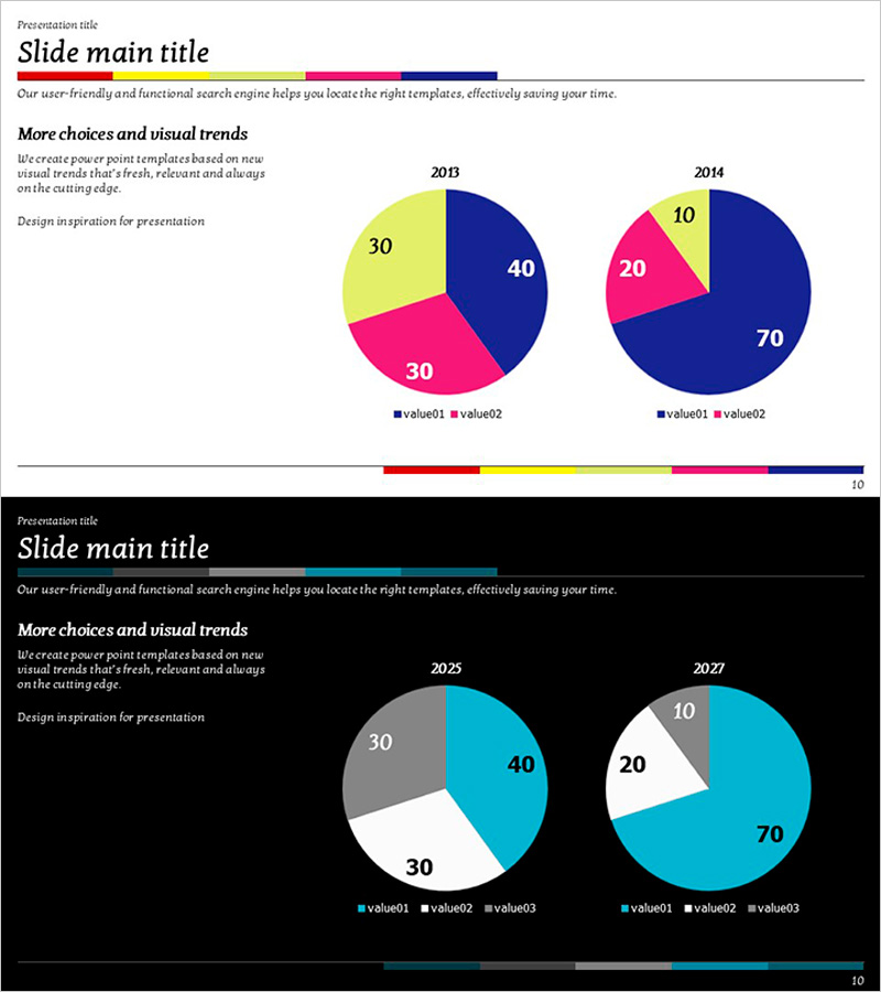
A side-by-side pie chart slide comparing 2013 and 2014 data with three-color segments in navy blue, magenta, and yellow. This 16:9 widescreen 2-slide set visualizes proportional changes across time periods with clear data representation. Ideal for marketing reports, business analysis presentations, and market research summaries where temporal data comparison is essential. All text, values, and legend elements are fully editable in PowerPoint, allowing you to adapt the charts to your specific statistics and corporate branding requirements.
Usage Points
-
Main Usage
The primary goal is to compare proportional data across two distinct time periods at a glance. The three-color scheme—navy blue, magenta, and yellow—differentiates each segment clearly, while the side-by-side layout enables viewers to immediately recognize shifts in data distribution and identify trends.
-
How to Use
Apply this slide in quarterly or annual performance reports to show revenue composition changes, market share analysis presentations to track competitive positioning over time, customer satisfaction surveys to compare year-over-year sentiment distribution, and financial reviews to illustrate budget allocation shifts. Double-click any chart element to edit values, labels, or colors to match your corporate palette.
-
Recommended For
Marketing teams presenting quarterly performance metrics, finance departments tracking revenue or expense category changes, executive leadership dashboards, academic researchers visualizing statistical distributions, management consultants preparing client analysis reports, and business analysts comparing period-over-period KPIs.
-
Slide Structure
Each slide contains a title section, descriptive text, and two pie charts arranged horizontally. The 2013 chart displays navy 40%, magenta 30%, yellow 30%; the 2014 chart shows navy 70%, magenta 20%, yellow 10%—clearly illustrating proportional shifts. A color bar at the bottom maintains visual consistency across your presentation deck.
Related Products
-

Structure Presentation Template Doughnut Chart – Market Analysis and Marketing Strategy
#Market and Competitor Analysis #Marketing Plan and Strategy #Graph
-

Financial Analysis Circular Bar Chart – Optimized Template for Market and Competitor Analysis
#Market and Competitor Analysis #Graph #Competitor Analysis
-

Camping Market Trend Survey Line Graph – Trend Displayed in Orange and Yellow
#Market and Competitor Analysis #Graph #Other
-

An Analysis of Hamburger Market Trends – SWOT and Market Dynamics
#Market and Competitor Analysis #Financial Plans and Performance #Graph
