4 Sets of Basic Donut Charts – Essential for Data Visualization
RJ0600066_12
- Last Update 07/07/2025
- File Size 8.5MB
- # of Slides 2
- File Format PPTX
- Slide Ratio 16:9
- Color
Keywords
About the Product
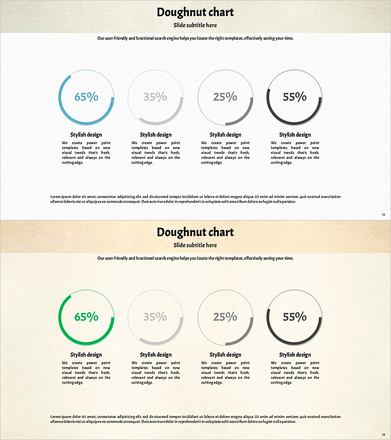
A set of 4 donut charts in PowerPoint slide format for intuitive data ratio visualization. Each chart features a distinct color scheme—blue, green, gray, and black—with percentage values displayed in the center and descriptive text areas below each chart. The 2-slide deck in 16:9 widescreen format is ready to use in presentations, reports, and business communications. Fully editable in PowerPoint, allowing you to customize data values, colors, labels, and descriptions to match your specific reporting needs.
Usage Points
-
Main Usage
Designed to display data composition, market share, budget allocation, and distribution across up to 4 categories. Each donut chart independently shows percentage breakdown with a central space for additional information or key metrics. Ideal for comparing proportional data across departments, regions, product lines, or time periods in a clear, visually organized manner.
-
How to Use
Select each donut chart on the slide and input your data values using PowerPoint's chart editing feature. The chart automatically updates to reflect percentage changes. Customize colors, line thickness, and label positions through the shape formatting menu. Edit the text descriptions below each chart to clarify what each segment represents and add context to your data.
-
Recommended For
Finance, marketing, sales, and operations professionals preparing quarterly or annual reports, executive dashboards, investor presentations, board meetings, and training materials. Particularly effective when comparing 4 or fewer data categories where the central space of the donut allows for displaying key metrics or additional information alongside the ratio visualization.
-
Slide Structure
2-slide presentation with 4 donut charts per slide arranged in a 2×2 grid layout. First slide features blue, gray, and black color tones; second slide uses green, gray, and black. Each chart displays percentage in the center, with 'Stylish design' label and descriptive text area below. 16:9 widescreen format ensures compatibility with modern projectors and displays.
Related Products
-

Line Chart Visualizing the Trend of Eating Alone
#Market and Competitor Analysis #Graph #Market Status
-

Market Share and Analysis Graph – Blue, Orange, Green
#Market and Competitor Analysis #Graph #Market Share
-

Kids Drawing Line Graph – Emphasizing Performance
#Business Strategy #Financial Plans and Performance #Graph
-

Note Illustration Theme Chart – Market Analysis and Competitor Insights Tool
#Market and Competitor Analysis #Diagram #Graph
