Customer Analysis Rounding Graph – Effective Market Understanding
RJ0600064_15
- Last Update 07/07/2025
- File Size 0.4MB
- # of Slides 2
- File Format PPTX
- Slide Ratio 16:9
- Color
Keywords
About the Product
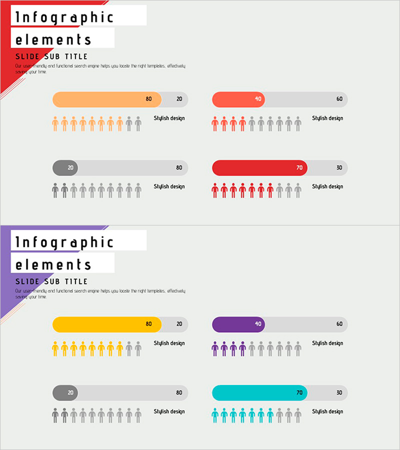
A 2-slide PowerPoint presentation designed to visualize customer analysis data with impact. Features four color-coded rounding graphs (orange, red, gray, purple) paired with human figure icons to communicate market insights effectively. Each slide employs a symmetrical comparison layout with dedicated data visualization areas and numerical input spaces on both sides. Ready to integrate into business presentations, sales decks, marketing plans, and strategic reports with minimal editing required.
Usage Points
-
Main Usage
Presents customer segmentation, market share, and competitive analysis through combined numerical and visual elements, providing clear decision-making support. The symmetrical side-by-side layout enables direct data comparison, making it ideal for market analysis sections where insights must be communicated with precision.
-
How to Use
Input actual customer analysis data into the rounding graph values and text fields on each slide. Use the color coding system (orange, red, gray, purple) to distinguish between data categories, and adjust the number of human figures to represent proportional relationships. Customize titles and descriptive text to match your presentation context.
-
Recommended For
Marketing professionals, executives, and analysts presenting customer segmentation, market conditions, and competitive findings. Suitable for business plans, marketing strategies, investor presentations, quarterly reports, and strategic planning sessions where data-driven decision-making is essential.
-
Slide Structure
2-slide layout. Each slide contains one title area, left comparison section (one rounding graph, two numerical fields, ten human icons, one text block), and right comparison section (one rounding graph, two numerical fields, ten human icons, one text block). Color-coded header bar (orange, red, gray, purple) visually distinguishes categories.
Related Products
-

Gender Ratio Customer Analysis 3D Circle Graph – Insights for Market Understanding
#Market and Competitor Analysis #Graph #Other
-

Orange Green Customer Analysis and Bell Chart
#Market and Competitor Analysis #Graph #Other
-

User Usage Analysis Status Graph
#Market and Competitor Analysis #Graph #Other
-

Work Performance Analysis Graph – Visually Representing Employee Performance
#Market and Competitor Analysis #Graph #Other
