Violin Donut Chart – Effective Data Visualization
RJ0600064_10
- Last Update 07/07/2025
- File Size 0.8MB
- # of Slides 2
- File Format PPTX
- Slide Ratio 16:9
- Color
Keywords
- #Content-Based Slides
- #Design-Based Slides
- #Product/Service Introduction
- #Business Introduction
- #Graph
- #Features
- #Technological Status
- #Circles
- #Doughnut Chart
- #16:9
- #donut chart PowerPoint slide
- #pie chart data visualization
- #percentage comparison template
- #donut graph slide design
- #how to create donut chart in PowerPoint
About the Product
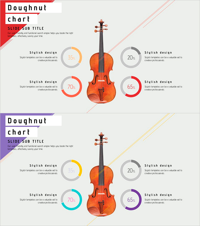
A creative PowerPoint slide featuring a violin image at the center with four donut charts arranged symmetrically around it. Each donut chart uses distinct colors (orange, red, gray, blue, purple) to represent percentage data intuitively. The 2-slide set offers two color variations, allowing you to match your presentation theme and brand identity. Ideal for visualizing product performance metrics, technology status analysis, market share distribution, and comparative data across multiple categories in professional presentations.
Usage Points
-
Main Usage
Simultaneously visualizes and compares four percentage-based metrics such as product performance indicators, technology status, market share, and customer satisfaction. The central violin image effectively emphasizes music, arts, creativity-related topics or emotionally resonant brand messaging.
-
How to Use
Edit the percentage values and labels on each donut chart to input your actual data. Select the appropriate color variation (warm or cool tones) to match your presentation background and brand colors. Use in product introduction, technology status briefing, and market analysis sections to highlight key metrics.
-
Recommended For
Product marketing managers, technology status report presenters, market analysts, creative industry professionals (music, arts, media), and presenters requiring emotionally engaging data visualization.
-
Slide Structure
Violin image positioned at center with four donut charts arranged at top, bottom, left, and right. Each chart contained within a gray circular frame with colored donut graph and percentage text. Dynamic composition enhanced by diagonal accent lines. Both slides maintain identical layout with only color palette variations (warm red-orange vs. cool blue-purple tones).
Related Products
-

Doughnut Chart for Financial Performance Visualization – Current Technology Status
#Business Introduction #Financial Plans and Performance #Diagram
-

Visualizing Military Data with Donut Chart – Power of Trust
#Product/Service Introduction #Business Introduction #Diagram
-

Geometric Pattern Wide PPT Donut Chart – Business Introduction
#Company Introduction #Business Introduction #Graph
-

Firefighter Illustration Infographic – Eye-Catching Visuals
#Product/Service Introduction #Business Introduction #Diagram
