Button Bar Chart for Visualizing Sales Status – Competitive Advantage Analysis
RJ0600059_5
- Last Update 07/06/2025
- File Size 4.8MB
- # of Slides 2
- File Format PPTX
- Slide Ratio 16:9
- Color
Keywords
- #Content-Based Slides
- #Design-Based Slides
- #Market and Competitor Analysis
- #Financial Plans and Performance
- #Graph
- #Competitive Advantage
- #Sales and Revenue
- #Horizontal Bar
- #Horizontal Bar Chart
- #16:9
- #horizontal bar chart PowerPoint
- #bar graph slide template
- #sales performance visualization
- #data comparison chart
- #4-item bar chart PowerPoint download
About the Product
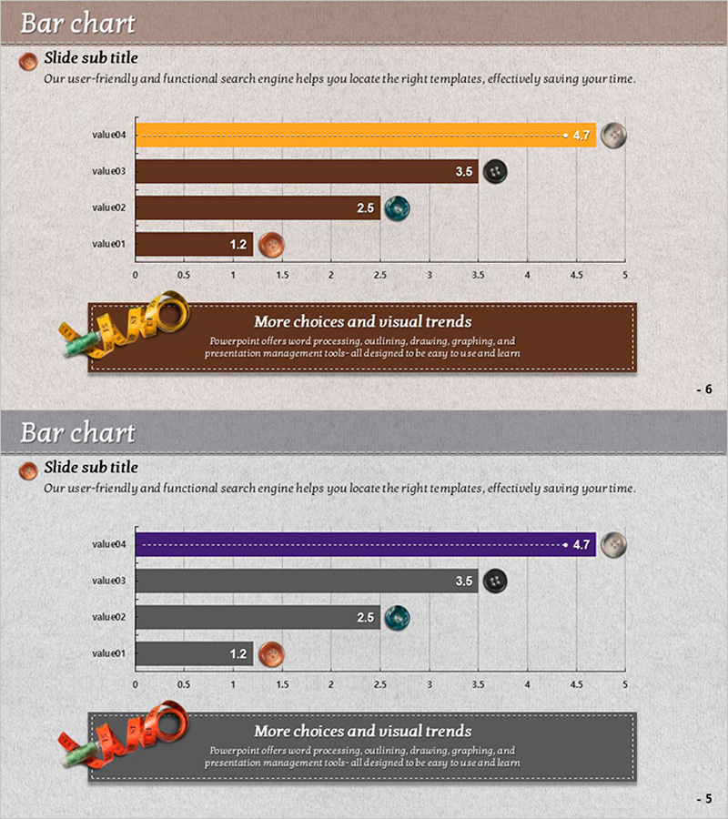
A horizontal bar chart PowerPoint slide comparing four data items with clear numerical values. The design features orange, brown, and gray bar colors paired with circular icons for each category, making quantitative comparisons immediately visible. Ideal for sales reports, competitive analysis, performance dashboards, and financial presentations. The 2-slide set includes both beige and gray background versions in 16:9 widescreen format, ready to integrate into modern business presentations.
Usage Points
-
Main Usage
Visualizes quantitative data comparisons across four categories in a clear, hierarchical format. Perfect for displaying sales figures, market share, performance metrics, or benchmark data where relative magnitude and ranking are critical to the message.
-
How to Use
Insert into executive reports, quarterly business reviews, marketing presentations, and competitive analysis decks. The color-coded bars and circular icons draw attention to top performers and enable quick visual comparison without detailed explanation.
-
Recommended For
Sales managers, marketing professionals, financial analysts, and executives presenting performance data. Suitable for quarterly reviews, market analysis, departmental comparisons, customer satisfaction surveys, and any data-driven business presentation.
-
Slide Structure
Four horizontal bars (value01–value04) with distinct colors (orange, brown, gray) and corresponding circular icons. Numerical labels appear at the bar endpoints. Two-slide layout accommodates both beige and gray backgrounds for flexible design integration.
Related Products
-

Leather Material Presentation Template Horizontal Bar Graph - Sales and Competitive Analysis
#Market and Competitor Analysis #Financial Plans and Performance #Graph
-

Design Style Preference Analysis – Insights into Market Competition
#Market and Competitor Analysis #Financial Plans and Performance #Graph
-

Horizontal Bar Chart for Analyzing Yacht Tour Preference
#Market and Competitor Analysis #Financial Plans and Performance #Graph
-

Bar Chart Analysis of Cosmetics Trends – Boosting Competitiveness
#Market and Competitor Analysis #Financial Plans and Performance #Graph
