War and Increase/Decrease Graphs - A Stylish Design for Visual Trends
RJ0600056_31
- Last Update 07/05/2025
- File Size 2.6MB
- # of Slides 2
- File Format PPTX
- Slide Ratio 16:9
- Color
Keywords
About the Product
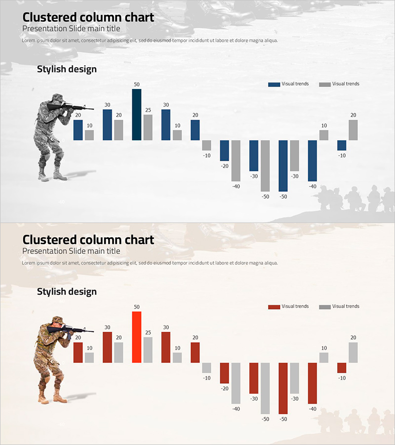
A clustered column chart PowerPoint slide optimized for military situation analysis and strategic presentations. This slide effectively compares two-series increase/decrease data side-by-side, using navy and gray dual-tone colors to convey professional authority. The soldier silhouette illustration on the left reinforces tactical and strategic context, while the background geopolitical map elements suggest geographic analysis. The chart displays both positive and negative values, making it ideal for visualizing military indicators such as force changes, casualty trends, and recovery scales. Provided in editable PPTX format, ready for immediate use in defense, security, and strategic analysis presentations.
Usage Points
-
Main Usage
Ideal for military situation analysis, strategic defense presentations, national security policy explanations, force change visualization, and casualty-recovery comparisons. The clustered arrangement clearly emphasizes differences between two data series, making complex military metrics accessible to audiences.
-
How to Use
Replace the bar values and legend with your own data. The navy and gray color scheme maintains professional tone, while the soldier silhouette and background geopolitical map reinforce tactical and geographic context. Use the positive/negative axis to represent force changes, losses, recovery, and other strategic indicators.
-
Recommended For
Defense ministry officials, military strategists, security policy analysts, international relations researchers, defense industry professionals, and tactical training instructors presenting defense policies, military analysis reports, strategic meetings, and educational seminars.
-
Slide Structure
Two-slide set. First slide features navy-toned 2-series clustered bars; second slide presents red-toned variation. Each slide contains 10-item clustered columns (mixed positive/negative values), 2-series legend, left-side soldier silhouette, and background geopolitical map elements.
Related Products
-

Trends in Heavy Equipment Utilization – Market Analysis
#Business Introduction #Market and Competitor Analysis #Graph
-

Comparison of Change Curves – Market and Competitor Analysis
#Market and Competitor Analysis #Graph #Market Status
-

Drone Performance Comparison Analysis Graph – Data Visualization
#Product/Service Introduction #Market and Competitor Analysis #Graph
-

Market Analysis Bundle Bar Graph - Effective Competitor Analysis
#Market and Competitor Analysis #Graph #Competitor Analysis
