War Damage Analysis through Graphs
RJ0600056_25
- Last Update 07/05/2025
- File Size 2.2MB
- # of Slides 2
- File Format PPTX
- Slide Ratio 16:9
- Color
Keywords
About the Product
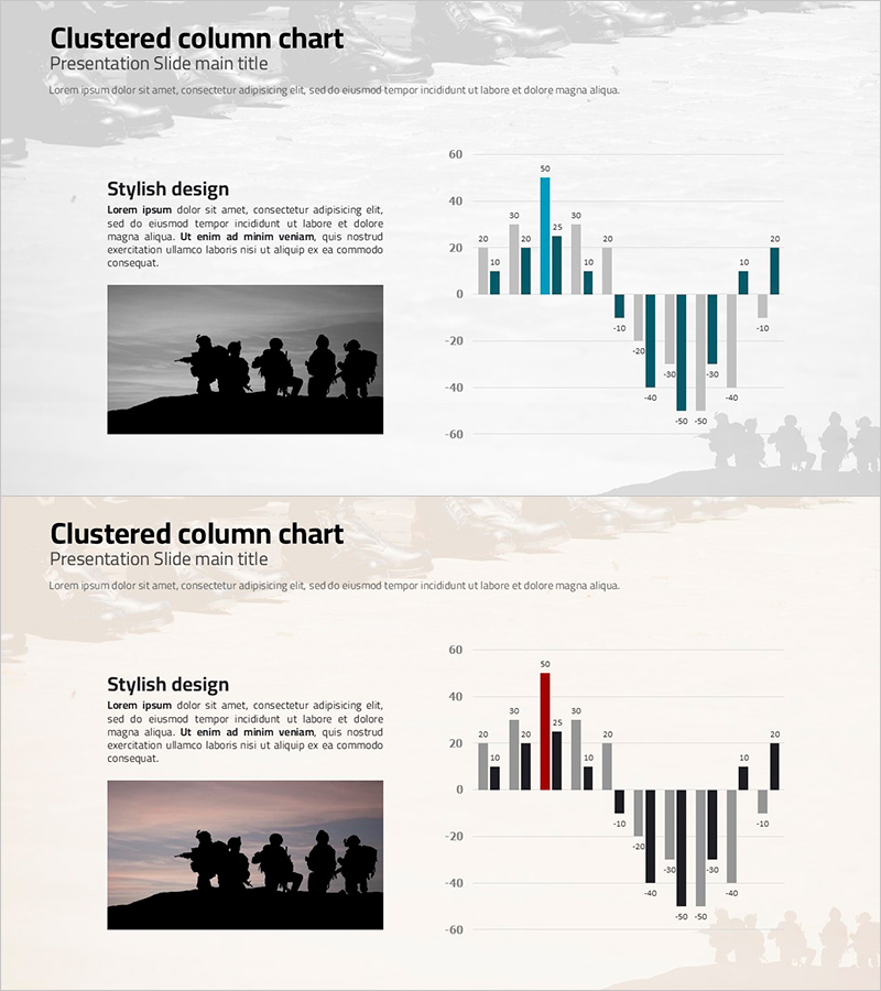
A two-slide PowerPoint presentation featuring a clustered column chart designed to display positive and negative data simultaneously. The chart uses a multi-series structure with gray, blue, and red color schemes to compare multiple data categories, while the two-column layout combines an image area on the left with the chart visualization on the right. Available in 16:9 widescreen PPTX format for immediate editing, this slide deck is ideal for presentations requiring comparative analysis such as loss assessment, damage analysis, performance comparison, and financial reporting.
Usage Points
-
Main Usage
Visualizes positive and negative data simultaneously to communicate comparative analysis clearly. Effectively represents data requiring positive-negative distinction such as losses, damages, decreases, and trends, while the multi-series structure enables efficient comparison across multiple categories.
-
How to Use
Insert relevant photos or illustrations in the left image area and input actual data in the right chart section. You can maintain the gray, blue, and red color scheme or customize it to match your organization's brand colors. Simply modify axis labels and legend entries to fit your data.
-
Recommended For
Recommended for presentations involving economic analysis, loss evaluation, damage statistics, performance comparison, financial reports, market analysis, and policy assessment. Suitable for consulting firms, government agencies, financial institutions, insurance companies, and research organizations using data-driven decision-making materials.
-
Slide Structure
Two-slide layout with each slide divided into a left image area (approximately 40%) and right clustered column chart area (approximately 60%). The chart displays approximately 10 data categories on the X-axis and 3 data series on the Y-axis, with positive and negative bars arranged symmetrically around a center axis.
Related Products
-

Comparison Bar Graphs and Core Doughnut Charts – Performance Analysis
#Business Introduction #Business Strategy #Graph
-

Camera and Vertical Stacked Charts Slide
#Business Strategy #Financial Plans and Performance #Graph
-

Comparison Graph of Construction Performance by Year
#Business Strategy #Market and Competitor Analysis #Graph
-

Green & Gray Template Wide Growth Graph
#Business Strategy #Graph #Achievements
