Infographic Chart On How to Attack – Market Share Analysis
RJ0600056_24
- Last Update 07/05/2025
- File Size 2.8MB
- # of Slides 2
- File Format PPTX
- Slide Ratio 16:9
- Color
Keywords
About the Product
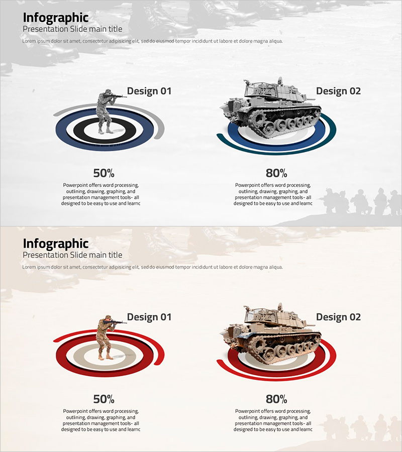
A 2-slide infographic PowerPoint presentation designed for market share analysis and competitive strategy comparison. The concentric circle layout visualizes two attack strategies (Design 01, Design 02) with 50% and 80% proportions, supporting data-driven decision-making in strategy development. Available in two color options—navy blue and red tones—each slide features a title section, descriptive text area, and comparative numerical structure. Delivered in 16:9 widescreen PPTX format, fully editable and ready for immediate use in marketing strategy presentations, business plans, investor pitches, and competitive analysis reports.
Usage Points
-
Main Usage
This slide set visualizes market share analysis and competitive strategy comparison using data-driven infographics. The concentric circle design presents two strategic approaches with quantified metrics, enabling decision-makers to evaluate options and justify strategic choices. Ideal for competitive positioning, market entry strategies, and performance benchmarking in business presentations.
-
How to Use
Enter your analysis topic in the slide title area (e.g., market entry strategy, competitive response plan). Fill in strategy names, descriptions, and numerical data in the text boxes under each Design section. Select the color scheme (navy blue or red) that matches your presentation's overall tone for visual consistency and professional appearance.
-
Recommended For
Marketing professionals, strategy planning teams, and executives presenting market analysis findings. Particularly effective when comparing two competitive strategies, market entry approaches, customer segment analysis, or performance metrics. Suitable for business plans, marketing strategy presentations, investor relations materials, and competitive intelligence reports.
-
Slide Structure
Two-slide layout with each slide containing: title and subtitle area (1 section), central infographic zone (2 Design comparisons), and descriptive text area (2 sections). The concentric circle design emphasizes numerical comparison, while dual color options (navy blue and red) provide flexibility in visual customization.
Related Products
-

Sales Status Analysis Graph – Simple and Stylish Design
#Product/Service Introduction #Market and Competitor Analysis #Graph
-

Analysis graph of market share progress
#Product/Service Introduction #Market and Competitor Analysis #Graph
-

Financial Business Analysis Pie Chart – Market Share Insights
#Product/Service Introduction #Market and Competitor Analysis #Graph
-

Idea Development Status Graph – Clear Data Visualization with Doughnut Chart
#Product/Service Introduction #Market and Competitor Analysis #Graph
