Graph of Changes After a Healthy Diet – Data Visualization Template
RJ0600054_6
- Last Update 07/05/2025
- File Size 2.1MB
- # of Slides 2
- File Format PPTX
- Slide Ratio 16:9
- Color
Keywords
About the Product
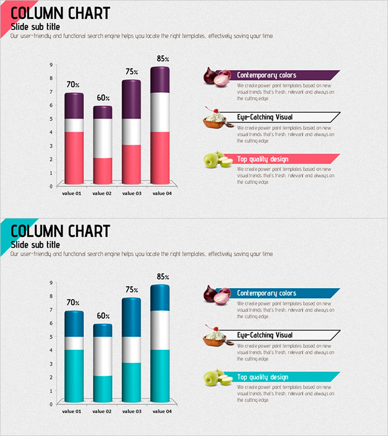
A vertical column chart PowerPoint slide that visualizes health diet changes through numerical data. Composed of two color series in pink and purple tones, it compares four items (value 01 to 04) for effective data analysis. The right side features three key message boxes (Contemporary colors, Eye-Catching Visual, Top quality design) with accompanying icons, making it ready for immediate use in presentations and reports. Formatted in 16:9 widescreen with 2 slides, all elements are fully editable.
Usage Points
-
Main Usage
Used to visually compare numerical changes in health, wellness, and diet-related projects. The bar heights represent four data points, enabling intuitive communication of trends and relative size comparisons. Ideal for presentations in medical, fitness, and nutrition fields.
-
How to Use
Double-click the bar heights, values, and labels to replace them with your own data. Edit the three key message boxes on the right to add your core messages. Adjust the overall color tone using theme color changes, and replace icons via the Insert tab with alternative images as needed.
-
Recommended For
Health program result reports, diet achievement presentations, nutrition consultation materials, fitness center marketing content, medical institution patient education resources, and wellness company business reports.
-
Slide Structure
A two-series vertical column chart (pink and purple) comparing four items. The left side displays Y-axis scale (0–9) and four X-axis labels (value 01–04), with two colored bars overlapping at each item. The right side contains three text boxes (Contemporary colors, Eye-Catching Visual, Top quality design) with corresponding icons.
Related Products
-

3D Segmented Bar Graph for Performance Analysis – Market Trends
#Market and Competitor Analysis #Graph #Customer Analysis
-

Visualizing Four-Year Change in Sales – An Effective Tool for Market Analysis
#Market and Competitor Analysis #Graph #Market Analysis
-

5-Year Real Estate Volume Chart – Market Analysis
#Market and Competitor Analysis #Graph #Market Analysis
-

Vertical Bar Chart for Learning Outcomes Comparison - Market Share Visualization
#Market and Competitor Analysis #Graph #Market Analysis
