Pointed Graph Chart – The Pinnacle of Data Visualization
RJ0600052_5
- Last Update 07/04/2025
- File Size 0.4MB
- # of Slides 2
- File Format PPTX
- Slide Ratio 16:9
- Color
Keywords
About the Product
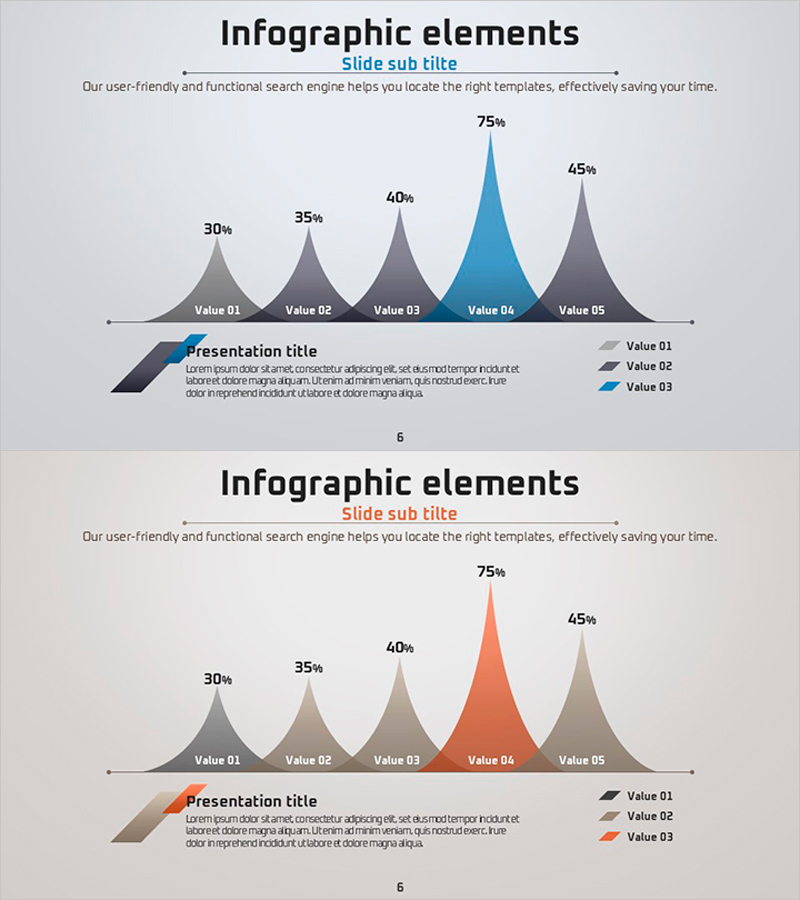
This free area chart slide visualizes data changes over time with a distinctive peaked mountain shape that emphasizes the highest value. The chart displays five data points (30%, 35%, 40%, 75%, 45%) with a light gray background and accent color highlighting (blue or orange) to draw attention to key metrics. Simply replace the text labels and numerical values in PowerPoint to instantly apply this slide to business plans, reports, marketing presentations, and investor pitches. The slide includes a legend and data labels, requiring no additional editing for immediate use in your presentation. Explore more chart and graph slide templates on GoodPello for additional visualization options.
Usage Points
-
Main Usage
To compare and analyze changes in multiple data points over time while emphasizing peak values or specific moments to capture audience attention.
-
How to Use
Replace the five data values (30%, 35%, 40%, 75%, 45%) with your own numbers, change the legend labels (Value 01–05) to your actual item names, and update the title and subtitle text.
-
Recommended For
Business professionals, data analysts, marketing managers, and presenters explaining growth rates, sales trends, market share changes, or performance metrics in investor presentations.
-
Slide Structure
Single-slide design with title and subtitle at the top, descriptive text, a 5-point area chart in the center, and a legend with data labels at the bottom.
Related Products
-

Tree Yellow Purple Area Chart – Innovation in Data Visualization
#Free Graphs
-

Business Comparison Analysis Graph – Strengthening Market and Competitor Analysis
#Free Graphs
-

Market Analysis Graph – Harmony of Pink and Bluegreen
#Free Graphs
-

Competitive Advantage Bar General Graph – Emphasizing Performance through Market Analysis
#Free Graphs
