Energy Saving Future Outlook Vertical Bar Graph
RJ0600050_10
- Last Update 07/04/2025
- File Size 0.2MB
- # of Slides 2
- File Format PPTX
- Slide Ratio 16:9
- Color
Keywords
- #Content-Based Slides
- #Design-Based Slides
- #Market and Competitor Analysis
- #Financial Plans and Performance
- #Graph
- #Future Outlook
- #Sales and Revenue
- #Column
- #Grouped Column
- #16:9
- #vertical bar chart PowerPoint
- #dual-series bar graph
- #data comparison slide template
- #energy saving chart
- #financial analysis presentation
About the Product
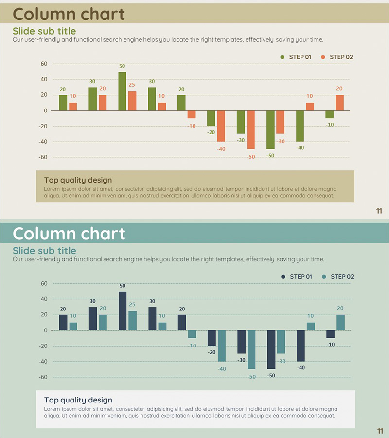
A dual-series vertical bar chart PowerPoint slide designed to visualize energy saving initiatives and future outlook projections. The chart uses green and orange color series to distinguish between two data sets, clearly displaying step-by-step numerical changes across multiple data points. Optimized for 16:9 widescreen format with a 2-slide layout, this template is ready for immediate use in financial reports, market analysis presentations, business performance reviews, and strategic planning decks. Numeric labels appear above each bar for precise data communication, and the structure supports both positive and negative values for comprehensive data representation.
Usage Points
-
Main Usage
Enables side-by-side comparison of two data series to illustrate trends and changes over time. Ideal for visualizing energy conservation targets versus actual results, quarterly revenue comparisons, budget versus actual performance analysis, and other quantitative data visualization needs.
-
How to Use
Input your data into the provided bar chart template on each slide. Use the green (STEP 01) and orange (STEP 02) color series to distinguish between two data items. Modify bar heights and numeric labels to reflect your actual figures. The chart structure accommodates negative values, making it suitable for variance and growth analysis.
-
Recommended For
Finance teams presenting budget analysis reports, energy management departments showcasing conservation achievements, marketing teams analyzing market data, executive briefing materials, and any presentation requiring quantitative comparison of two variables. Particularly effective for performance reviews and strategic planning sessions.
-
Slide Structure
Two-slide layout featuring identical vertical bar chart structures. Each slide displays 10 data points on the horizontal axis with a numerical scale ranging from -60 to 60 on the vertical axis. Two bars (green and orange) appear side-by-side for each data point, with numeric labels positioned above each bar for clear data identification.
Related Products
-

Eco-farming Agriculture Future Outlook Vertical Bar Chart
#Market and Competitor Analysis #Financial Plans and Performance #Graph
-

Orange Green Profit and Loss Chart – Visualizing Revenue and Profit
#Financial Plans and Performance #Diagram #Graph
-

Column Chart for Product Service Sales Outlook – Harmony of Blue and Orange
#Technical Approach #Market and Competitor Analysis #Graph
-

Triangle Pattern Column Chart Presentation Template
#Market and Competitor Analysis #Financial Plans and Performance #Diagram
