Traffic Accident Cause Pie Chart
RJ0600047_6
- Last Update 07/03/2025
- File Size 1.3MB
- # of Slides 2
- File Format PPTX
- Slide Ratio 16:9
- Color
Keywords
About the Product
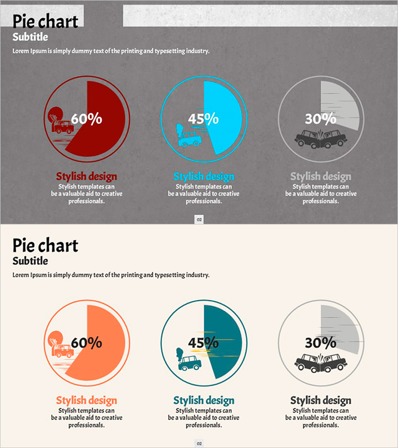
A PowerPoint pie chart slide that visualizes traffic accident causes across three proportional segments. The design features three distinct pie charts in dark red, sky blue, and gray tones, with percentage values and icons centered in each chart for immediate data comprehension. This 2-slide template is ready to integrate into business reports, market analysis presentations, and proposal decks for instant deployment.
Usage Points
-
Main Usage
Visualize three-way proportional data—such as accident causes, incident factors, or market share—using pie chart format to communicate data composition clearly to audiences.
-
How to Use
Insert into business report analysis sections, market research presentations, or proposal decks to support data-driven decision-making. Edit percentage values and icons to match your specific dataset and presentation context.
-
Recommended For
Transportation, logistics, insurance, and safety professionals; market analysts; business planners; and policy makers who need to prepare data-backed presentations quickly.
-
Slide Structure
2-slide layout. Slide 1: dark gray background with three pie charts in dark red, sky blue, and gray arranged horizontally, each with centered percentage and icon. Slide 2: beige background with orange, teal, and gray pie charts in identical structure.
Related Products
-

Travel Survey Results – Market Share Visualization
#Market and Competitor Analysis #Graph #Market Status
-

Agricultural Equipment Investment Plan Pie Chart
#Market and Competitor Analysis #Graph #Market Status
-

Pie Chart for Market Share Analysis – Data Visualization
#Market and Competitor Analysis #Graph #Market Status
-

Pie Chart for Oriental Medicines Market Overview
#Market and Competitor Analysis #Graph #Market Status
