Ice Blue-Orange Line Chart – Clarity in Data Visualization
RJ0600045_8
- Last Update 07/03/2025
- File Size 0.4MB
- # of Slides 2
- File Format PPTX
- Slide Ratio 16:9
- Color
Keywords
About the Product
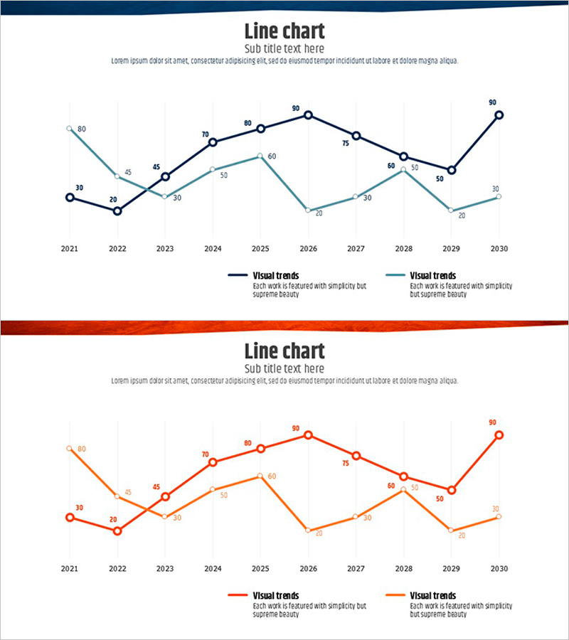
A dual-series line chart PowerPoint slide tracking data changes from 2021 to 2030 across a 10-year period. The ice blue and orange trend lines intersect and diverge, clearly visualizing comparative patterns. Each data point displays numerical labels for precise value comparison, while the grid background aids coordinate reading. The 2-slide set presents identical data in different color combinations, allowing selection based on presentation context. Immediately applicable to financial reports, marketing performance analysis, business results presentations, and quantitative data-driven communications.
Usage Points
-
Main Usage
Compare two or more data series over time to clearly express performance fluctuations across years or months. Effectively communicate quantitative KPIs such as financial metrics, sales volume, customer satisfaction, and market share trends to stakeholders.
-
How to Use
Replace each data point and numerical label with actual statistical values. Modify legend text to match corresponding metric names and adjust year or month intervals as needed. Retain the color scheme or customize to match brand colors.
-
Recommended For
Finance teams presenting quarterly and annual performance reports, marketing teams analyzing campaign effectiveness, sales teams explaining revenue trends, executive KPI dashboards, and investor presentations demonstrating growth potential.
-
Slide Structure
Both slides follow identical structure with 10 time-axis points (2021–2030) and 2 data series. The first slide uses ice blue and light blue tones, while the second uses orange and light orange tones. Each data point includes numerical labels for precise reference.
Related Products
-

Ship Logistics Equipment Status Analysis – Facility and Market Overview
#Business Introduction #Market and Competitor Analysis #Graph
-

Visualizing Sales Performance with Structural Photos and Graphs
#Financial Plans and Performance #Graph #Sales and Revenue
-

Bar Chart Analysis of Causes of Marital Conflict
#Market and Competitor Analysis #Graph #Customer Analysis
-

Carbon Neutral Customer Survey Pie Chart
#Market and Competitor Analysis #Graph #Market Status
