Orange Comparative Chart Analysis – Efficient Data Visualization
RJ0600044_6
- Last Update 07/02/2025
- File Size 6.9MB
- # of Slides 2
- File Format PPTX
- Slide Ratio 16:9
- Color
Keywords
About the Product
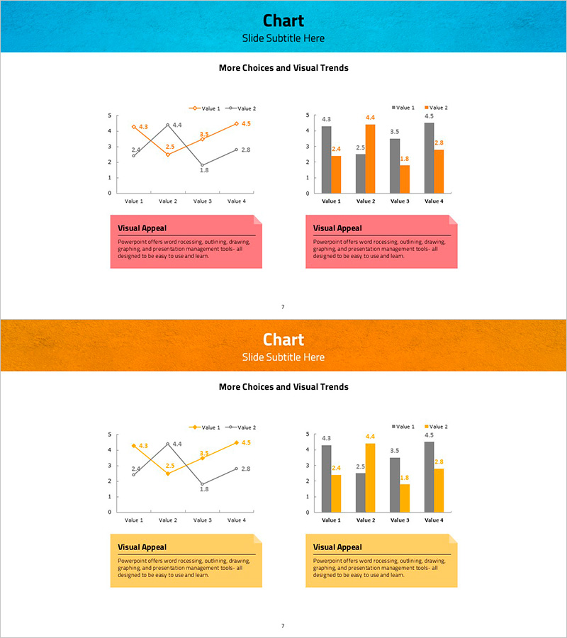
A 2-slide PowerPoint template combining line and bar charts in a cohesive orange color scheme. The left slide displays two line series and one bar series to show trends and absolute values simultaneously across four data items. The right slide uses two bar series for direct item-by-item comparison. Each slide includes an editable pink text box below the chart for adding insights and analysis notes. Designed in 16:9 widescreen format for modern presentation environments, with fully editable data points and labels.
Usage Points
-
Main Usage
Visualize multiple data series simultaneously while emphasizing trend changes and comparative values. The combination of line and bar elements enables multi-layered data analysis, making it ideal for reports, analytical presentations, and business reviews where complex datasets need clear visual communication.
-
How to Use
Open the slide and double-click chart elements to edit data values. Update legend labels and axis titles to match your data categories. Customize the text box below each chart with your analysis findings. Maintain the orange color scheme or adjust theme colors to align with your corporate branding.
-
Recommended For
Financial analysis, sales performance comparison, market research, project status reporting, customer satisfaction trends, and KPI tracking. Effective for executives, marketing teams, analysts, and consultants presenting quantitative data to stakeholders.
-
Slide Structure
2-slide set. Left slide: dual-axis chart with 2 line series (orange and gray) and 1 bar series (orange) across 4 Value items, pink text box below. Right slide: 2 bar series (gray and orange) for 4-item comparison with matching text box. 16:9 widescreen, PPTX format, fully editable.
Related Products
-

Donut Chart Visualizing Recycling Survey Data
#Market and Competitor Analysis #Graph #Market Share
-

Sports Future Expected Effects and Numerical Graphs
#Market and Competitor Analysis #Graph #Other
-

Red-Blue Stereoscopic Pie Charts – Performance Visualization
#Company Introduction #Market and Competitor Analysis #Diagram
-

Performance Status Graph by Period – Systematic Analysis
#Graph
