Business Trend Graph by Year – Market Analysis Insight
RJ0500018_6
- Last Update 06/11/2025
- File Size 0.8MB
- # of Slides 2
- File Format PPTX
- Slide Ratio 16:9
- Color
Keywords
- #Content-Based Slides
- #Design-Based Slides
- #Market and Competitor Analysis
- #Financial Plans and Performance
- #Diagram
- #Graph
- #Industry Trends
- #Income Statement
- #Table
- #Column
- #Standard Table
- #Segmented Column
- #16:9
- #vertical column chart PowerPoint
- #business trend analysis slide
- #stacked bar chart template
- #market analysis PowerPoint slide
- #year-over-year comparison chart
About the Product
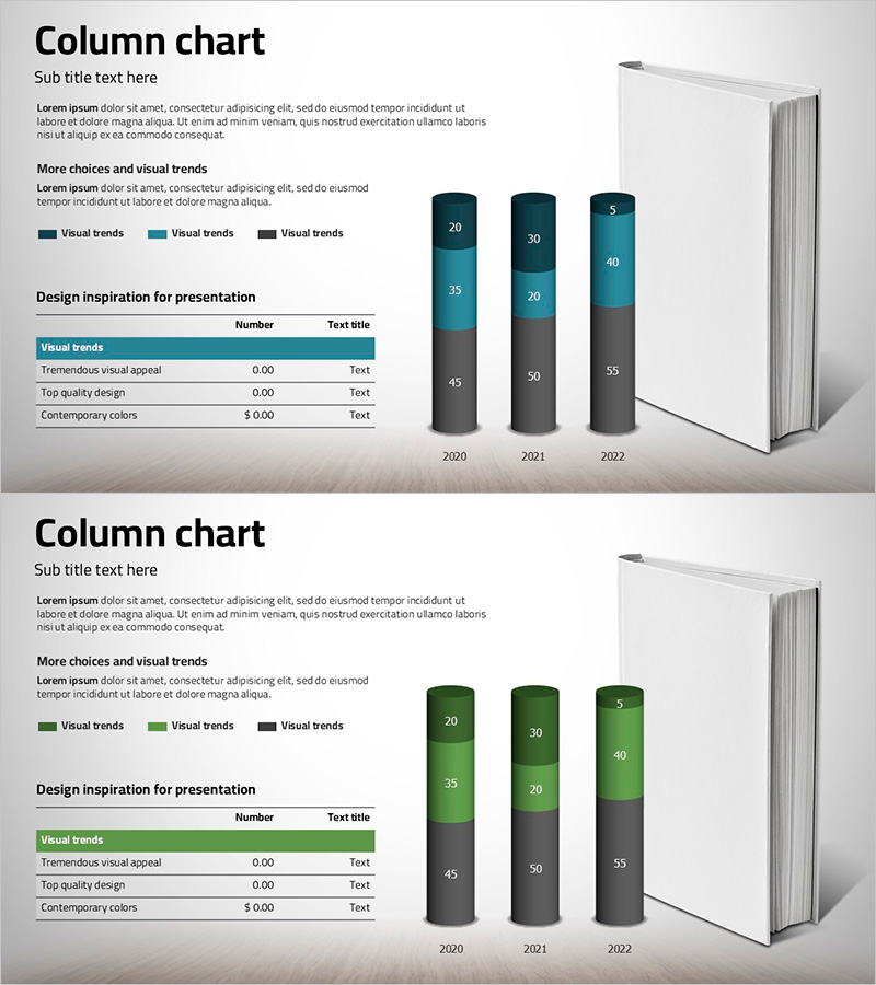
A vertical column chart PowerPoint slide that visualizes business trends by year. This presentation template displays data from 2020 to 2022 across three data series, using teal and black color contrast to establish clear information hierarchy. Each year's columns are stacked to show cumulative values, making it ideal for market analysis, business performance comparison, and sales trend presentations. The 2-slide set provides the same data visualization in two color themes—teal and green—allowing you to match your presentation's visual tone. Fully editable and ready for immediate use in business reports and investor presentations.
Usage Points
-
Main Usage
This slide compares business data across three years using a stacked vertical column chart. Each year displays three distinct data series, enabling clear visualization of market trends, revenue progression, and departmental performance. The design facilitates data-driven decision-making through quantitative comparison.
-
How to Use
Use this slide in market analysis sections, business performance reports, and investor pitch decks when presenting year-over-year comparative data. The stacked column format with color differentiation allows audiences to instantly grasp multi-series data, while accompanying text reinforces key insights and conclusions.
-
Recommended For
Finance professionals, marketing strategists, and executives preparing performance reports will find this template valuable. It works well for quarterly and annual performance analysis, market size comparisons, product line sales trends, and any multi-series time-series data visualization.
-
Slide Structure
Two-slide set, each containing a stacked vertical column chart representing three years (2020, 2021, 2022) with three data series per year. The first slide uses a teal color palette, while the second employs a green palette. Both include legend, title area, and text description space for context.
Related Products
-

Market Analysis with Horizontal and Vertical Bar Charts – Recent Trends Review
#Market and Competitor Analysis #Financial Plans and Performance #Diagram
-

Big Data Market Analysis Graph – Trends and Performance
#Market and Competitor Analysis #Financial Plans and Performance #Diagram
-

Red Green Market Analysis Slide – Effective Data Visualization
#Business Strategy #Market and Competitor Analysis #Diagram
-

Sea Illustration Market Trend Chart – Visual Market Analysis
#Market and Competitor Analysis #Diagram #Graph
