Analyzing Future Prospect Graphs
RJ0600036_14
- Last Update 06/30/2025
- File Size 0.3MB
- # of Slides 2
- File Format PPTX
- Slide Ratio 16:9
- Color
Keywords
- #Content-Based Slides
- #Design-Based Slides
- #Market and Competitor Analysis
- #Diagram
- #Graph
- #Future Outlook
- #Industry Trends
- #Table
- #Column
- #Standard Table
- #Segmented Column
- #16:9
- #100% stacked column chart PowerPoint
- #percentage comparison slide template
- #data visualization PowerPoint
- #year-over-year analysis slide
- #stacked bar chart template download
About the Product
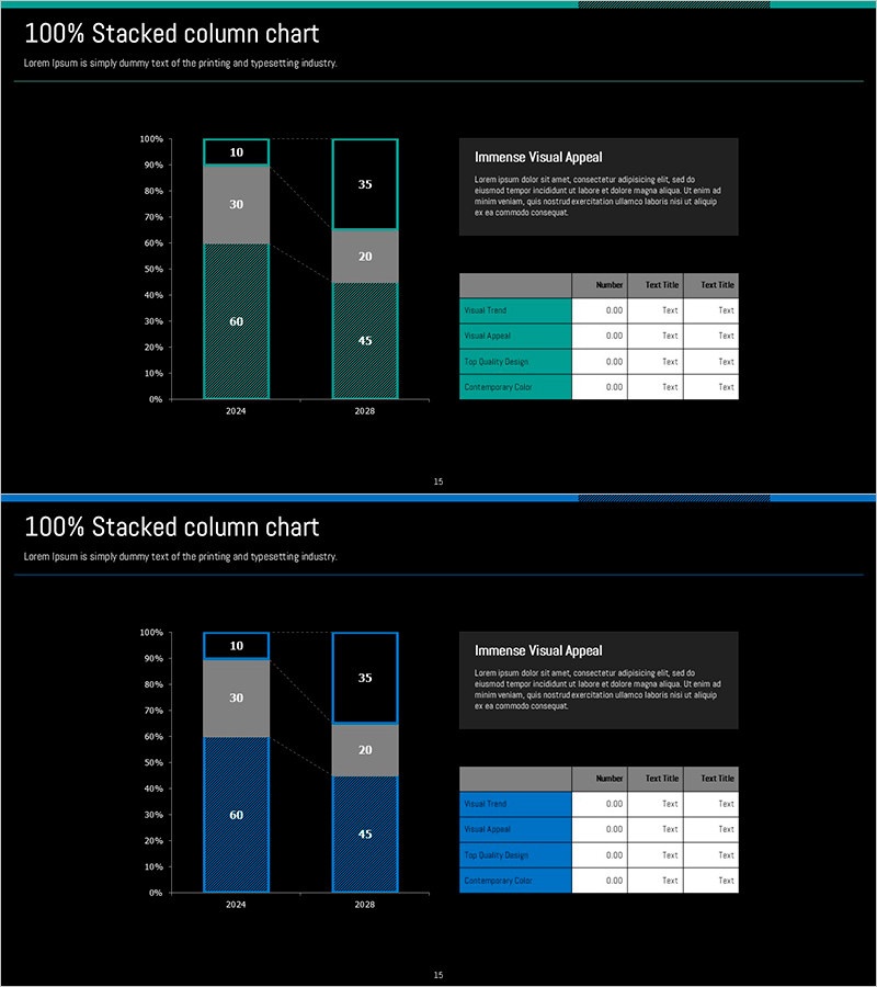
A 100% stacked column chart PowerPoint slide comparing data across 2024 and 2028. Each year displays four components (10, 30, 60, and remainder) expressed as percentages, with teal and gray color differentiation for clear visual hierarchy. The right side includes a descriptive text box and a four-row data table for supplementary information. This slide deck is ready to use in business presentations, market analysis reports, performance reviews, and strategic planning sessions.
Usage Points
-
Main Usage
Ideal for comparing component proportions and their changes over time using percentage-based visualization. Effectively communicates market share shifts, revenue composition changes, resource allocation trends, and customer segment evolution across multiple periods.
-
How to Use
Input your actual data into the left chart area and add analysis details and figures to the right text box and table. Maintain the color scheme and add a legend for enhanced clarity. Suitable for business reports, marketing analysis, financial presentations, and performance reviews.
-
Recommended For
Executives, marketing managers, financial analysts, consultants, and project managers who rely on data-driven decision-making. Ideal for quarterly or annual performance comparisons, market trend analysis, strategy meetings, and stakeholder presentations.
-
Slide Structure
Two-slide set with each slide featuring a 100% stacked column chart on the left (two years, four data series) and a title, descriptive text box, and four-row data table on the right. Three-tier color scheme (teal, gray, light gray) distinguishes each component, with dotted connector lines emphasizing numerical relationships.
Related Products
-

Market Growth Chart for Business Insights
#Market and Competitor Analysis #Diagram #Graph
-

Camping Business Trend Graph – Future and Vision
#Market and Competitor Analysis #Graph #Customer Analysis
-

Sea Illustration Market Trend Chart – Visual Market Analysis
#Market and Competitor Analysis #Diagram #Graph
-

Business Trend Graph by Year – Market Analysis Insight
#Market and Competitor Analysis #Financial Plans and Performance #Diagram
