Eco-farming Agriculture Expected Return on Investment Analysis – Design and Data Visualization
RJ0600033_25
- Last Update 06/29/2025
- File Size 1.4MB
- # of Slides 2
- File Format PPTX
- Slide Ratio 16:9
- Color
Keywords
- #Content-Based Slides
- #Design-Based Slides
- #Product/Service Introduction
- #Business Strategy
- #Graph
- #Development Status
- #Achievements
- #Circles
- #Doughnut Chart
- #16:9
- #doughnut chart PowerPoint
- #pie chart slide template
- #ratio analysis chart
- #ROI visualization
- #data comparison slides
- #how to create doughnut chart in PowerPoint
About the Product
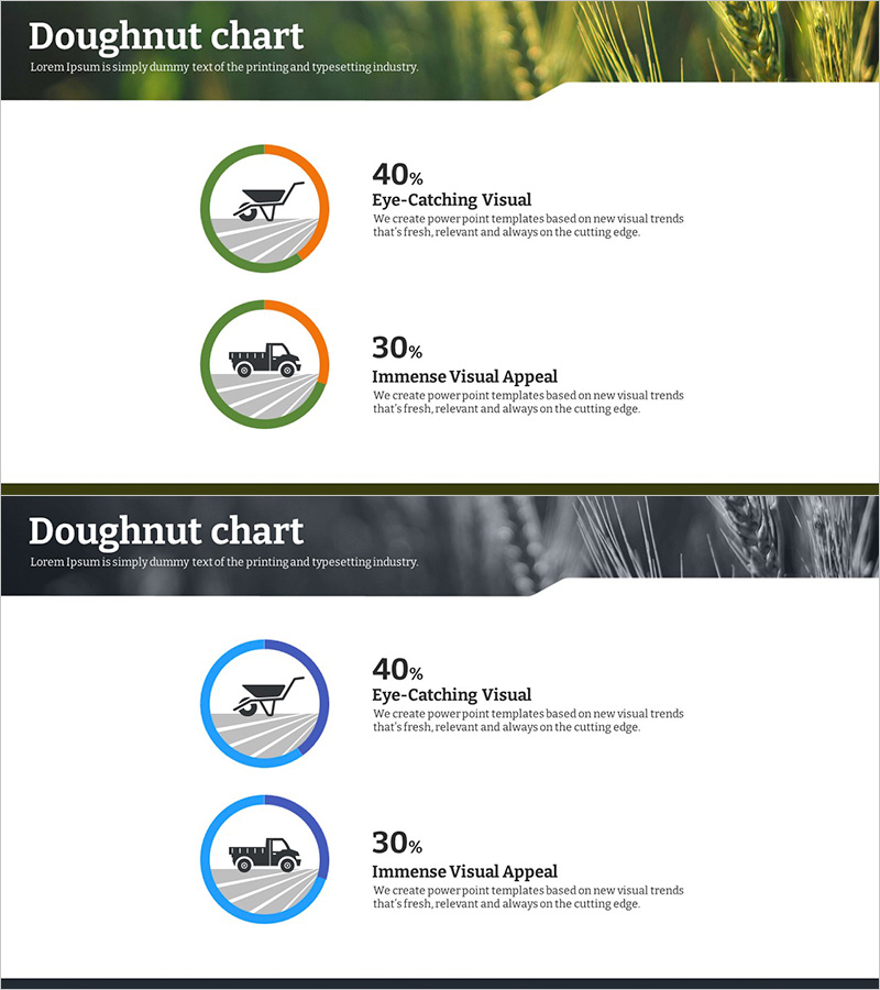
A doughnut chart PowerPoint slide designed for eco-farming agriculture return on investment analysis. The two-tone green and orange circular chart intuitively displays the ratio of two data segments, with icons and percentage labels positioned for enhanced readability. Optimized for 16:9 widescreen format across 2 slides, this presentation template is ready to use for investment impact analysis, business performance comparison, market share visualization, and other data-driven presentations.
Usage Points
-
Main Usage
Visualizes the proportional relationship between two data categories such as investment returns, business performance metrics, or market share. The hollow center of the doughnut allows for additional key figures or titles, improving information delivery efficiency.
-
How to Use
Use in business presentations, investor pitch meetings, and performance reports to compare two-category composition ratios. Simply edit the percentages and labels with your own data for immediate use. Colors and icons can be customized to match your presentation theme.
-
Recommended For
Ideal for executives, financial analysts, marketing strategists, and consultants who need to communicate quantitative data clearly. Particularly suited for investment impact analysis, business performance evaluation, and market analysis presentations.
-
Slide Structure
2-slide layout. Each slide features one doughnut chart in green and orange tones, with percentage labels and descriptive text positioned to the right, and category icons (wheelbarrow, truck) on the left. Optimized for 16:9 widescreen display.
Related Products
-

Blue Green Progress Visualization – Graph for Achievement Rate
#Product/Service Introduction #Business Strategy #Market and Competitor Analysis
-

Progress Timeline – Visualization of Business Strategies
#Product/Service Introduction #Business Strategy #Diagram
-

Interior Preference Donut Chart – Data Visualization
#Product/Service Introduction #Business Strategy #Graph
-

Core Exercise Donut Chart – Visualizing Performance and Development
#Product/Service Introduction #Business Strategy #Graph
