



Eco Friendly Bar Graph Chart – The Optimal Choice for Data Visualization
RJ0600029_12
- Last Update 06/28/2025
- File Size 0.4MB
- # of Slides 2
- File Format PPTX
- Slide Ratio 16:9
- Color
Keywords
About the Product
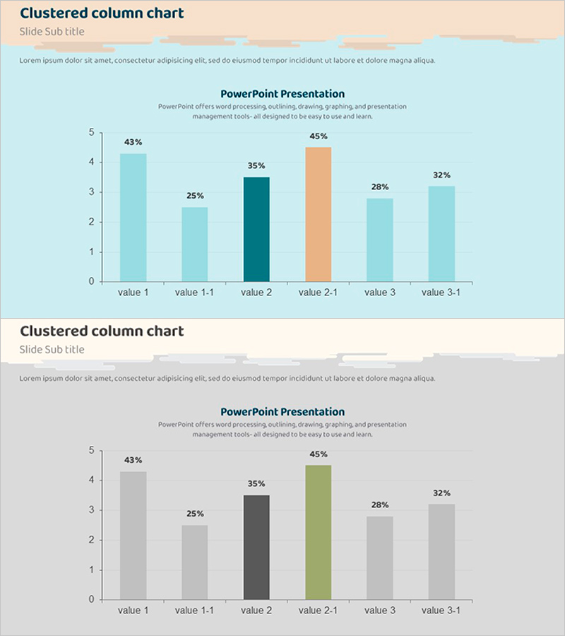
A clustered column chart PowerPoint slide designed to compare 2-3 data series across 6 items simultaneously. The chart uses distinct color series—light cyan, dark teal, and coral orange—to clearly differentiate each data set, with percentage labels displayed above each column for precise data interpretation. Formatted in 16:9 widescreen ratio with 2 slides, all elements are fully editable for immediate customization to your data. Ideal for business reports, marketing analysis, performance presentations, and any scenario requiring effective numerical comparison and trend visualization across multiple metrics.
Usage Points
-
Main Usage
Optimized for comparing 2 or more data series across multiple items side-by-side. Effectively visualizes competitive benchmarking, quarterly KPI tracking, product performance metrics, and customer satisfaction across categories. Percentage labels ensure accurate numerical comparison and quick insight extraction.
-
How to Use
Apply to marketing performance reviews comparing your metrics against competitors, quarterly business reports showing multiple KPI trends, product strategy meetings displaying customer preference survey results, and investor presentations highlighting multi-dimensional growth. All values, colors, and labels are editable using standard PowerPoint tools for real-time data updates.
-
Recommended For
Finance, marketing, sales, and strategic planning teams presenting data-driven insights. Suitable for executive briefings, investor relations presentations, academic research presentations, and internal performance reviews. Particularly effective for B2B presentations requiring quantitative multi-metric analysis.
-
Slide Structure
2-slide layout with each slide displaying 6 items (value 1 through value 3-1) using clustered columns. Each column cluster contains 2-3 bars representing different data series, with percentage values (25%-45%) labeled above. Color differentiation—light cyan, dark teal, and coral—distinguishes series. Light background and clear axis lines ensure readability and professional appearance.
Related Products
-
Weather Area Diagram – Centralized Expansion
#Company Introduction #Business Introduction #Graph
-
Measurement Graph Slide – Market Analysis and Future Outlook
#Market and Competitor Analysis #Graph #Future Outlook
-
Camping Isometric Future Market Outlook Line Graph
#Market and Competitor Analysis #Financial Plans and Performance #Graph
-
Graph Template for Household Survey by Generation – Data Analysis
#Market and Competitor Analysis #Graph #Other