Related Indicators Line Graph – Essential Slide for Data Analysis
RJ0600023_10
- Last Update 06/26/2025
- File Size 0.1MB
- # of Slides 2
- File Format PPTX
- Slide Ratio 16:9
- Color
Keywords
About the Product
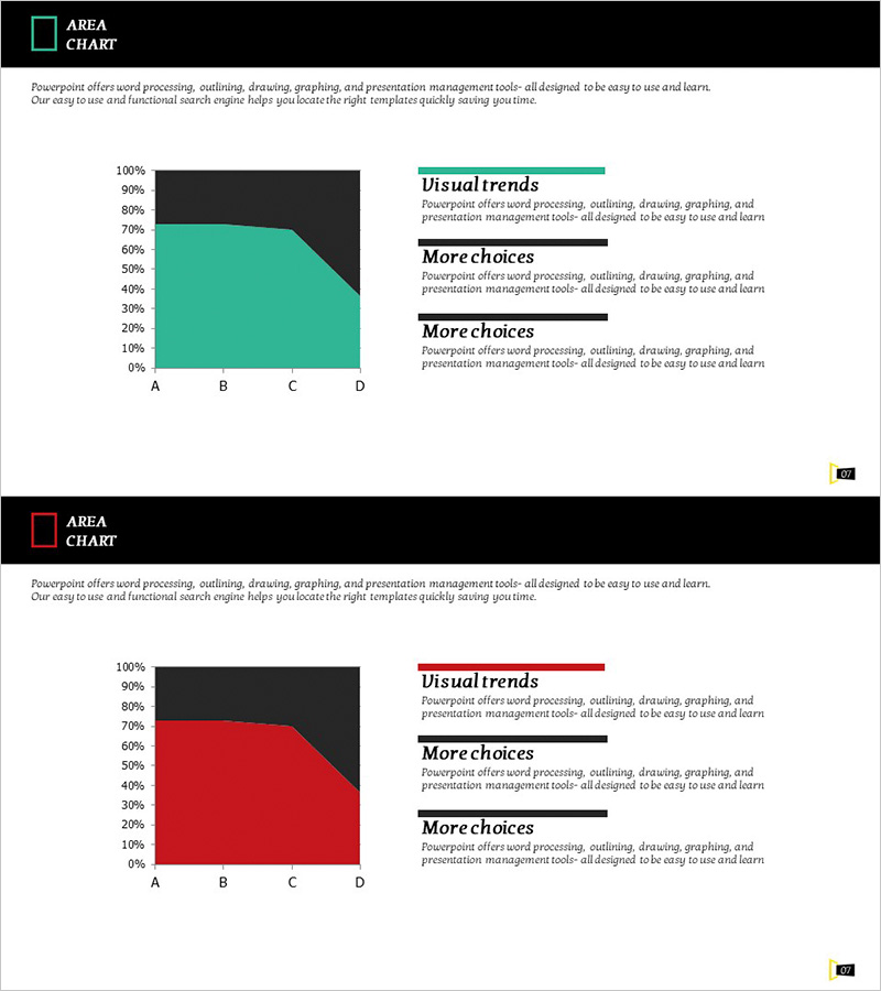
A PowerPoint line graph slide designed to visualize data trends and changes over time across multiple indicators. This 2-slide set tracks four items (A through D) with clear Y-axis scaling from 0% to 100%, making it ideal for business reports, marketing analysis, and financial presentations. The slides feature dark backgrounds with turquoise and red accent colors for strong visual contrast. Both slides are fully editable, allowing you to input your own data and customize labels, legends, and colors to match your presentation needs. Perfect for comparing performance metrics, sales trends, customer satisfaction scores, and market indicators.
Usage Points
-
Main Usage
Designed to compare and analyze multiple data series simultaneously over time. Effectively displays sales performance, customer satisfaction, market share, KPIs, and other metrics across four or more categories. Ideal for executive briefings, investor presentations, quarterly performance reviews, and strategic planning sessions.
-
How to Use
Double-click the chart area to access the data table and input your own values. Modify axis labels, legend entries, and data points to match your analysis. Adjust series colors if needed and add commentary text in the background area to highlight key insights and recommendations.
-
Recommended For
Financial analysts, marketing managers, business strategists, executive presenters, management consultants, and data professionals. Suitable for quarterly performance comparisons, campaign effectiveness tracking, competitive benchmarking, customer behavior analysis, and any multi-metric trend presentation.
-
Slide Structure
Two-slide set, each featuring a line graph with Y-axis range 0%–100% and X-axis categories A, B, C, D. First slide uses turquoise and dark background; second slide uses red and dark background for design variation. Each data series is represented as an independent line, clearly showing individual trends and intersection points for easy comparison.
Related Products
-

Visualization of Traditional Items Proportion – Market Share Analysis
#Company Introduction #Market and Competitor Analysis #Graph
-

Children’s Activity Preferences Comparison – Market Status and Competitive Advantage
#Market and Competitor Analysis #Graph #Market Status
-

Geometry PPT Template Wide Vertical bar segmentation graph
#Business Introduction #Business Strategy #Graph
-

Children's Competency Analysis Graph – Visualization for Creativity and Growth
#Market and Competitor Analysis #Graph #Other
