Performance Chart by Year - Visualizing Performance Comparison
RJ0600016_13
- Last Update 06/24/2025
- File Size 0.3MB
- # of Slides 2
- File Format PPTX
- Slide Ratio 16:9
- Color
Keywords
About the Product
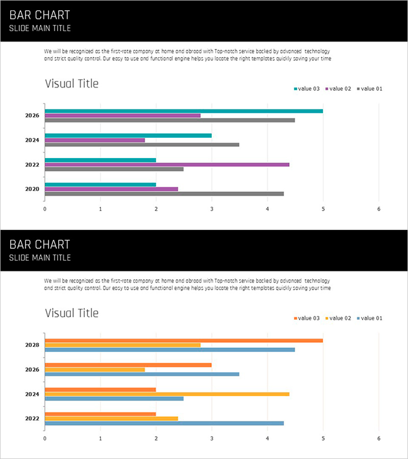
A horizontal bar chart PowerPoint slide set with 2 slides for visualizing year-over-year performance data from 2020 to 2026. This template enables side-by-side comparison of 3 data series across 4 years, making it ideal for business presentations including performance analysis, results evaluation, and budget comparisons. The design uses distinct color series—teal, orange, gray, and purple—to clearly differentiate each data series, with a 0-6 scale for easy numerical comparison. Provided in 16:9 widescreen PPTX format, optimized for modern presentation environments.
Usage Points
-
Main Usage
Compare time-series data such as annual results, performance metrics, or revenue across 3 or more series. The horizontal bar format clearly displays year labels and makes numerical differences between series immediately visible, making it suitable for executive reports, business performance presentations, and financial analysis materials.
-
How to Use
Adjust the length of the 3 bars for each year row to match your data, and update the legend series names to reflect actual categories (e.g., Target, Actual, Prior Year). Colors can be customized to match corporate branding, and titles and descriptive text can be added to align with your presentation context.
-
Recommended For
Recommended for CFOs, finance managers, business unit directors, marketing managers, and project leaders who need to report quantitative performance. Applicable to quarterly and annual results presentations, budget execution reports, departmental performance comparisons, and revenue trend analysis.
-
Slide Structure
2-slide set, each containing a horizontal bar chart with 4 years (2020, 2022, 2024, 2026) × 3 data series. Slide title area at the top, legend (value 01, value 02, value 03) in the upper right, with X-axis scale 0-6 and Y-axis year labels.
Related Products
-

Country's Representative Food – Market Share Analysis
#Market and Competitor Analysis #Graph #Market Status
-

User Analysis Graph by Age Group – Advanced Data Insights
#Market and Competitor Analysis #Diagram #Graph
-

Business Analysis with Doughnut Chart – Dawn City Theme
#Product/Service Introduction #Business Introduction #Diagram
-

Market Share and Analysis Graph – Red and Blue Integration
#Market and Competitor Analysis #Graph #Market Share
