Market Status by Line Chart – Must-Have for Market Analysis
RJ0600021_17
- Last Update 06/26/2025
- File Size 0.1MB
- # of Slides 2
- File Format PPTX
- Slide Ratio 16:9
- Color
Keywords
About the Product
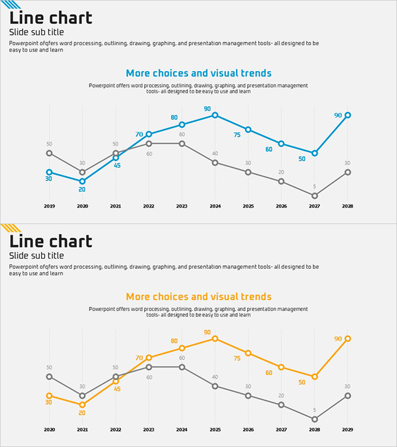
A professional line chart PowerPoint slide designed to visualize market trends and comparative data analysis across multiple time periods. This presentation template displays three data series (blue, orange, and gray) spanning from 2019 to 2028, making it ideal for business reports, marketing strategy presentations, and financial analysis briefings. Each data point is labeled with precise numerical values, ensuring clarity and accuracy in data communication. The two-slide set provides flexibility for different analytical scenarios and market positioning discussions. The grid background enhances readability, while the multi-series structure enables side-by-side comparison of performance metrics, market share, or revenue trends.
Usage Points
-
Main Usage
The primary objective is to clearly communicate temporal data trends and enable multi-series comparison. This slide effectively visualizes competitive performance, market share evolution, revenue progression, or KPI changes over extended periods, providing stakeholders with actionable business insights through visual trend analysis.
-
How to Use
Integrate this slide into quarterly or annual business reports, market analysis sections, competitive benchmarking presentations, financial performance reviews, and investor pitch decks. Simply replace the sample data points with your actual figures, and adjust the color scheme to match your corporate branding. The flexible layout accommodates various data ranges and analytical narratives.
-
Recommended For
Ideal for executives, business analysts, marketing strategists, financial managers, consultants, and sales leaders. Essential for presentations involving quarterly performance reviews, market trend analysis, competitive positioning, investor relations, and strategic planning sessions where multi-period data comparison is critical.
-
Slide Structure
Two-slide template featuring identical line chart layouts with three distinct data series (blue, orange, gray) plotted across a 10-year timeline (2019–2028). Each data point displays numerical values ranging from 5 to 90. The grid background facilitates value reading, while dedicated title and subtitle areas enable contextual explanation. The consistent structure supports narrative flow across multiple analytical scenarios.
Related Products
-

Drone Performance Comparison Analysis Graph – Data Visualization
#Product/Service Introduction #Market and Competitor Analysis #Graph
-

Vertical Bar Graph for Vision Growth – Business Development Strategy
#Company Introduction #Business Strategy #Graph
-

User Analysis Graph by Age Group – Advanced Data Insights
#Market and Competitor Analysis #Diagram #Graph
-

Cylinder Shape Graph & Table Slide – Visualizing R&D Data
#Technical Approach #Diagram #Graph
