Two-Way Color Contrast Graph – Visualization of Data Comparison
RJ0600067_10
- Last Update 07/07/2025
- File Size 0.2MB
- # of Slides 2
- File Format PPTX
- Slide Ratio 16:9
- Color
Keywords
About the Product
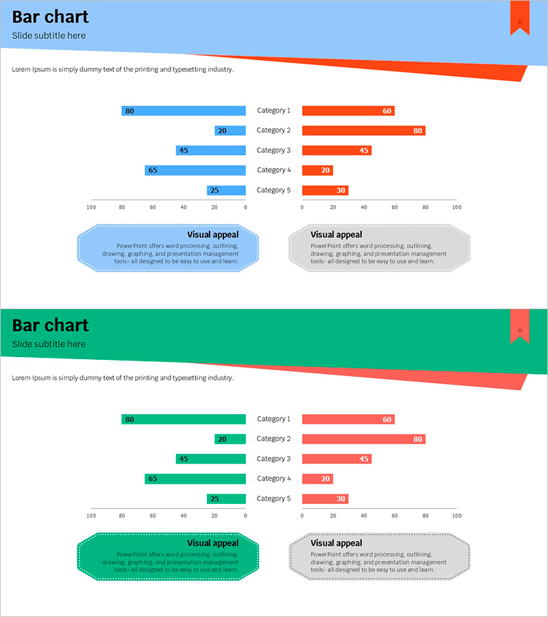
A symmetrical two-way bar chart PowerPoint slide designed for direct data comparison. The left side displays blue bars while the right side shows red bars, creating a clear visual contrast that makes it easy to compare two datasets side by side. Five categories are presented with numerical values on both axes, making it ideal for competitive analysis, performance benchmarking, and opinion surveys. The 2-slide set is fully editable, allowing you to customize category names, values, and colors to match your presentation needs.
Usage Points
-
Main Usage
Effectively compare two opposing datasets or groups simultaneously. The symmetrical layout and contrasting colors make it ideal for presenting competitive analysis, market comparisons, before-and-after metrics, demographic breakdowns, and any scenario requiring side-by-side data visualization.
-
How to Use
Double-click on category labels and numerical values to edit them directly. Blue bars represent left-side data while red bars represent right-side data. Simply input your comparison data and adjust the bar lengths accordingly. To change colors, select the bar shapes and modify the fill color from the formatting menu.
-
Recommended For
Marketing professionals, business analysts, project managers, and executives presenting competitive analysis, market research, performance reports, and strategic comparisons. Also suitable for academic presentations, survey results, statistical analysis, and any data-driven decision-making presentation.
-
Slide Structure
2-slide set featuring symmetrical two-way bar charts. Each slide displays 5 categories (Category 1–5) with blue bars extending left and red bars extending right from a center axis. Numerical labels appear at the end of each bar. Title area at the top and descriptive text box at the bottom provide space for context and interpretation.
Related Products
-

Visualizing Major Plant Composition with Donut Chart
#Product/Service Introduction #Market and Competitor Analysis #Graph
-

Overview of Mobile Phone Service Business
#Company Introduction #Business Introduction #Graph
-

Snow Mountain Theme Competitive Advantage Graph
#Product/Service Introduction #Market and Competitor Analysis #Graph
-

Art Science Closed Diagram – Creative Idea Gear
#Product/Service Introduction #Diagram #Graph
