Donation Participation Rate Graph – Success and Expectations
RJ0800016_11
- Last Update 08/04/2025
- File Size 0.3MB
- # of Slides 2
- File Format PPTX
- Slide Ratio 16:9
- Color
Keywords
- #Content-Based Slides
- #Design-Based Slides
- #Business Strategy
- #Technical Approach
- #Diagram
- #Graph
- #Financial Outlook & Expected Impact
- #Future Development Roadmap
- #Cluster
- #Line
- #Closed Cluster Diagram
- #Line Chart
- #16:9
- #line chart PowerPoint slide
- #multi-series trend graph
- #donation participation rate chart
- #3-line data visualization
- #how to create line chart in PowerPoint
About the Product
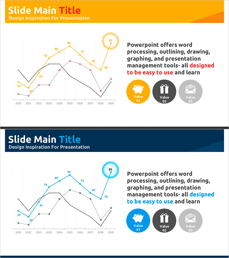
A multi-series line chart PowerPoint slide visualizing donation participation rates over a 10-year period from 2020 to 2029. Three data series are represented with distinct orange, blue, and black trend lines, each labeled with precise numerical values at data points for accurate comparison. The right side features three value proposition icons emphasizing outcomes and expected benefits. Designed in 16:9 widescreen format with 2 slides, this presentation template is ready for immediate use in donation campaign reports, business performance presentations, strategic planning sessions, and stakeholder communications.
Usage Points
-
Main Usage
Ideal for comparing multiple data series over time, such as donation participation rates, revenue trends, customer satisfaction metrics, and market growth rates. The 10-year timeline enables stakeholders to quickly identify patterns, growth trajectories, and performance benchmarks across different data categories.
-
How to Use
Apply to business performance reports (performance analysis section), investor pitch decks (market growth visualization), marketing strategy presentations (campaign effectiveness metrics), and business plans (goal achievement tracking). Easily edit data points and labels to reflect your own datasets and customize colors to match your brand guidelines.
-
Recommended For
Donation campaign managers, business analysts, marketing strategists, investor relations professionals, and business planning teams presenting trend analysis, comparative performance metrics, and strategic forecasts to executives and stakeholders.
-
Slide Structure
2-slide template set. Slide 1 features orange header with 3-series line graph (2020–2029 range, 30–95 scale) and three value icons on the right. Slide 2 uses dark blue header with identical graph structure rendered in blue color palette, providing design variation options for different presentation contexts.
Related Products
-

Highlighted Line Charts and Tables – Market Analysis and Revenue Forecast
#Business Strategy #Market and Competitor Analysis #Diagram
-

Business Strategy Analysis with Line Chart
#Business Strategy #Market and Competitor Analysis #Diagram
-

Cluster Diagram for Future Business Outlook
#Technical Approach #Diagram #Future Development Roadmap
-

System and Service Development Plan - Cluster Diagram
#Technical Approach #Diagram #Future Development Roadmap
