People Icon Infographic Chart – Market and Competitive Analysis
RJ0600019_25
- Last Update 06/26/2025
- File Size 0.4MB
- # of Slides 2
- File Format PPTX
- Slide Ratio 16:9
- Color
Keywords
About the Product
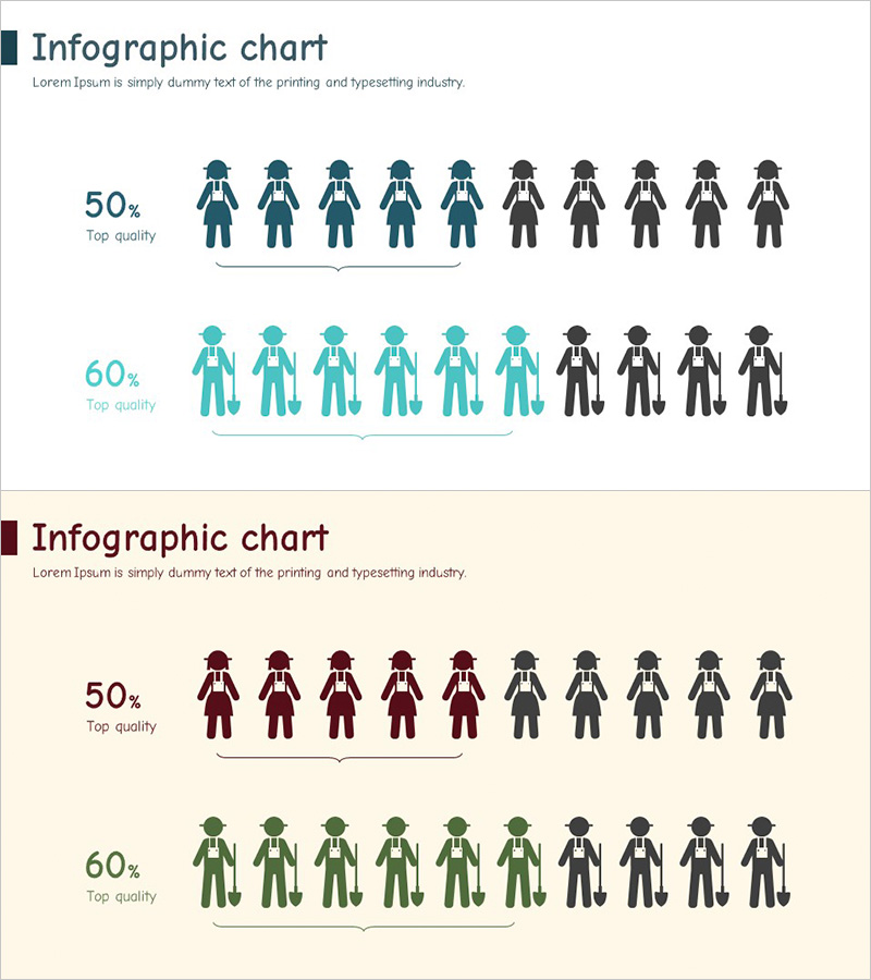
A PowerPoint infographic chart slide designed for market analysis and competitive comparison using people icons for ratio visualization. The 2-slide set features a title and description text area at the top, with 10 color-coded people icons arranged horizontally to clearly display percentage comparisons. Available in four color combinations: dark blue, turquoise, wine red, and green. Each slide represents 50% and 60% ratio data with distinct visual separation. The layout makes data interpretation intuitive and is ready for immediate use in presentations and reports.
Usage Points
-
Main Usage
This slide visualizes percentage data such as market share, customer satisfaction, and quality comparisons using people icons for intuitive understanding. It helps audiences grasp complex numerical data at a glance in competitive analysis and market overview sections.
-
How to Use
Enter your analysis category name (market share, customer satisfaction, etc.) in the title area at the top. Modify the percentage values on the left side to match your data. Adjust the number of color-coded people icons to accurately represent the ratio.
-
Recommended For
Ideal for executive reports, investor presentations, marketing strategy pitches, and market analysis reports. Finance teams, marketing departments, and strategy teams can use this to support data-driven decision-making.
-
Slide Structure
The 2-slide set includes one title area, one description text area, one percentage display area, and two people icon arrangement areas (by ratio) on each slide, with 10 icons per ratio section.
Related Products
-

Study Area Chart - Market Status and Competitive Advantage
#Market and Competitor Analysis #Graph #Other
-

Bar Chart Visualizing Yacht Tour Satisfaction
#Market and Competitor Analysis #Graph #Other
-

2 Versions of the Green Area Chart – Market Analysis and Competitive Edge
#Market and Competitor Analysis #Graph #Other
-

Recreation Activity Graph – Market and Competitive Advantage Analysis
#Market and Competitor Analysis #Graph #Other
