Carbon Neutral Infographic Eco-Friendly Battery Chart – Modern Technology and Sustainability
RJ0600018_10
- Last Update 06/25/2025
- File Size 0.4MB
- # of Slides 2
- File Format PPTX
- Slide Ratio 16:9
- Color
Keywords
- #Content-Based Slides
- #Design-Based Slides
- #Product/Service Introduction
- #Business Introduction
- #Graph
- #Other
- #Development Status
- #Technological Status
- #16:9
- #infographic PowerPoint slide
- #comparison chart template
- #four-column data visualization
- #technology overview slide
- #sustainability presentation template
About the Product
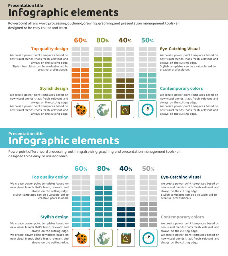
A data visualization slide that presents technology insights and sustainability metrics through infographic design. The slide features four distinct color columns (orange, green, brown, and teal) arranged in a comparative layout with percentage data, icons, and descriptive text. The balanced arrangement of visual elements and text descriptions makes complex information intuitive and accessible. This PowerPoint slide is ready to use for technology presentations, sustainability reports, and environmental initiatives, with fully editable colors, icons, and text fields.
Usage Points
-
Main Usage
Presents technology information and sustainability data across four comparable categories using percentage metrics, icons, and descriptive text. The layout emphasizes data clarity and visual hierarchy for effective information communication.
-
How to Use
Ideal for technology presentations, sustainability reports, environmental strategy briefings, and corporate responsibility communications. Simply replace the text, percentages, and icons with your own data to create a professional presentation slide.
-
Recommended For
Perfect for technology companies presenting sustainability initiatives, environmental policy briefings, new technology introductions, and corporate social responsibility (CSR) reports. Suitable for technical teams, marketing departments, and executive presentations.
-
Slide Structure
Title area at the top, followed by four vertical columns in the center. Each column contains a percentage value, color block, icon, and descriptive text aligned vertically for clear data comparison.
Related Products
-

Musicians and Gauge Charts Slide – The Uniqueness of Data Visualization
#Product/Service Introduction #Business Introduction #Graph
-

Analysis of Social Media Cloud Development Status – Stylish Donut Chart
#Product/Service Introduction #Business Introduction #Graph
-

Medical Research Progress Diagram – Innovation and Development
#Product/Service Introduction #Business Introduction #Diagram
-

Infographic Slide for Performance Analysis – Clear Visualization
#Product/Service Introduction #Business Introduction #Graph
