How to Measure Smart Health – Visualizing Effective Data Flow
RJ0600017_7
- Last Update 06/25/2025
- File Size 0.2MB
- # of Slides 2
- File Format PPTX
- Slide Ratio 16:9
- Color
Keywords
- #Content-Based Slides
- #Design-Based Slides
- #Operational Plan
- #Technical Approach
- #Diagram
- #Business Processes
- #Service Operation Plan
- #Flow
- #Cluster
- #Linear Flow
- #Chain Diagram
- #16:9
- #connected diagram PowerPoint
- #3-node flowchart
- #data flow visualization slide
- #system process diagram
- #healthcare data architecture
About the Product
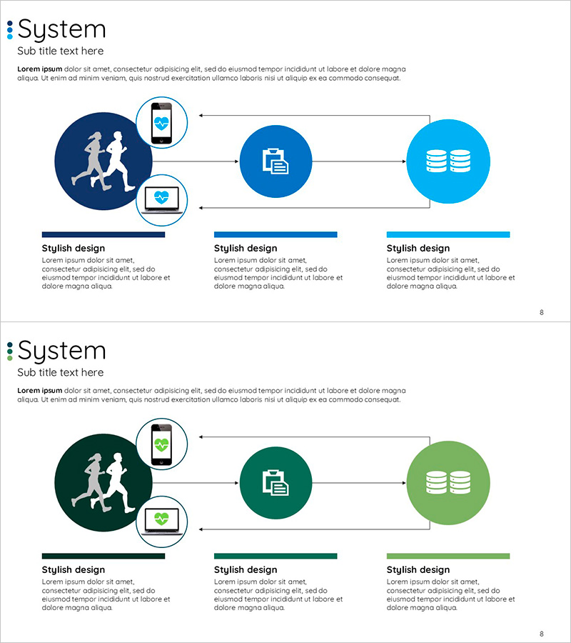
A 3-node connected diagram PowerPoint slide that visualizes smart health data flow. The structure features a dark blue circular node on the left, a medium blue node in the center, and a light blue node on the right, connected by bidirectional arrows representing user measurement → data processing → storage management. Each node includes icons (silhouettes, documents, database symbols) and device imagery (mobile and laptop) to intuitively convey system connectivity. Provided in two color versions (blue and green palettes) with 16:9 aspect ratio across 2 slides, ready for immediate editing and presentation use.
Usage Points
-
Main Usage
Explains technology-based data flows in smart health, IoT, and cloud systems using a 3-stage process model. Clearly represents the circular structure of user measurement → data processing → storage management, emphasizing system connectivity and operational efficiency.
-
How to Use
Deploy as a system overview slide at the beginning of presentations or within operational planning and technical architecture sections to explain data flow. Edit node text labels to match your system stages and select the color version that aligns with your presentation theme.
-
Recommended For
Ideal for healthcare, medical technology, and wellness companies presenting investment pitches, product introductions, and technical proposals. Also effective for IT, software, and cloud service companies explaining system architecture and operational plans.
-
Slide Structure
2-slide set. Each slide features 3 circular nodes (left dark blue, center medium blue, right light blue) connected by bidirectional arrows. The left node includes silhouette icons and device imagery (mobile and laptop), the center displays document icons, and the right shows database symbols, visually distinguishing each stage's function.
Related Products
-

Business Process Circular Diagram – Effective Service Operations
#Operational Plan #Technical Approach #Diagram
-

3 Service Operation Methods Using Climbing Ropes
#Operational Plan #Technical Approach #Diagram
-

Design Work Process Diagram – Business Strategy
#Business Strategy #Operational Plan #Diagram
-

Construction Work Flow System – Efficient Operation Planning and Risk Management
#Operational Plan #Diagram #Business Processes
