Layered Area Charts – Visualizing Data Trends
RJ0600016_11
- Last Update 06/24/2025
- File Size 0.3MB
- # of Slides 2
- File Format PPTX
- Slide Ratio 16:9
- Color
Keywords
About the Product
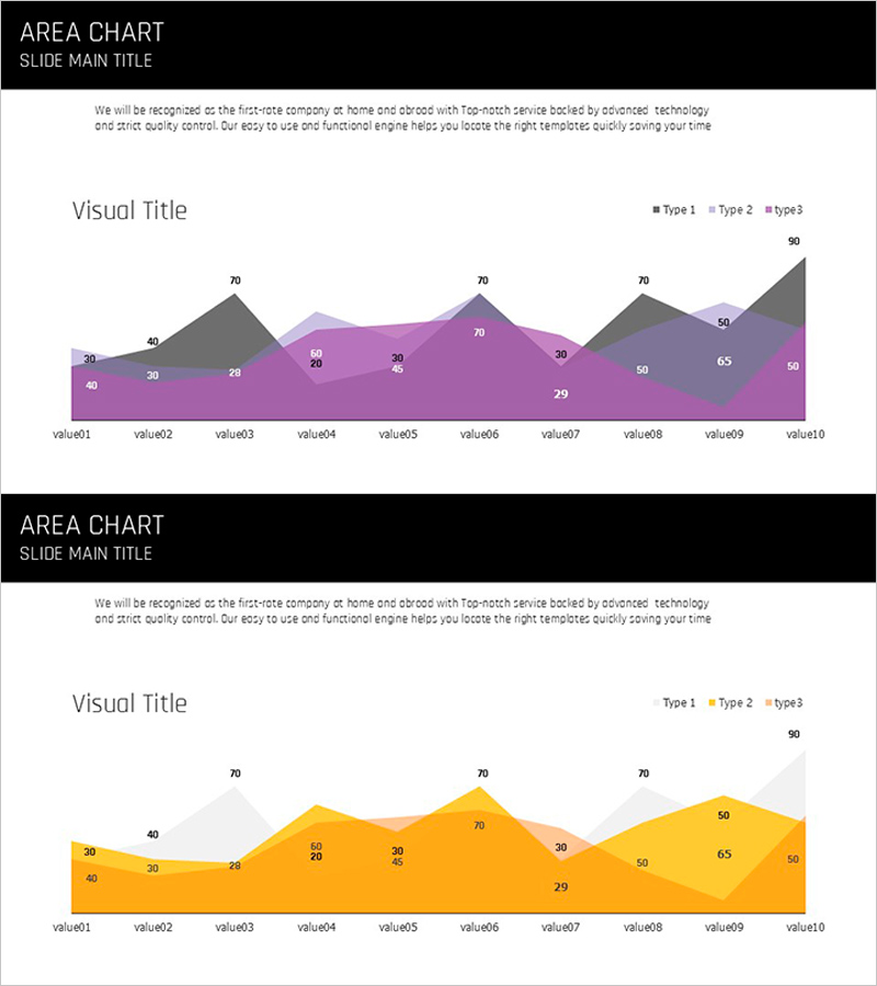
A multi-series area chart PowerPoint slide that stacks data layers to reveal cumulative trends over time. This template displays 10 time points across 3 distinct data series, each color-coded to show both individual values and total composition. Two design versions are included—one in purple, gray, and charcoal tones, and another in warm orange and gold—allowing you to match your presentation style. Perfect for sales performance, customer growth, market share, or budget allocation analyses that require showing both trend direction and relative magnitude.
Usage Points
-
Main Usage
Visualize cumulative changes across multiple data series over time, showing both individual trends and total composition. Area height represents magnitude while color distinguishes each series for intuitive data comprehension.
-
How to Use
Apply to quarterly business reviews, sales performance dashboards, customer segment analysis, budget breakdowns, and market share reports. Data values auto-populate across 10 time points when you input your figures.
-
Recommended For
Executive presentations, financial reports, marketing analytics, business planning sessions, and strategic reviews. Ideal for data-driven decision makers in finance, operations, and business development roles.
-
Slide Structure
10 X-axis time points (value01–value10) with 3 stacked data series (Type1, Type2, Type3) in distinct colors. Each series occupies a layer, with numeric values displayed on the chart. Two color schemes provided: purple-gray-charcoal and warm orange-gold palettes.
Related Products
-

Business Competitor Comparison Analysis Graph – Effective Investment and Strategy Development
#Market and Competitor Analysis #Graph #Competitor Analysis
-

Yellow Green Detailed Analysis Chart - Visualizing Market Trends
#Business Strategy #Market and Competitor Analysis #Diagram
-

Competitor Analysis Broken Line Graph
#Market and Competitor Analysis #Graph #Competitor Analysis
-

Target Country Analysis Chart – Data Visualization for Market Analysis
#Market and Competitor Analysis #Graph #Other
