Analyzing 3 Pie Charts – Insights through Data Visualization
RJ0600012_6
- Last Update 06/24/2025
- File Size 0.2MB
- # of Slides 2
- File Format PPTX
- Slide Ratio 16:9
- Color
Keywords
About the Product
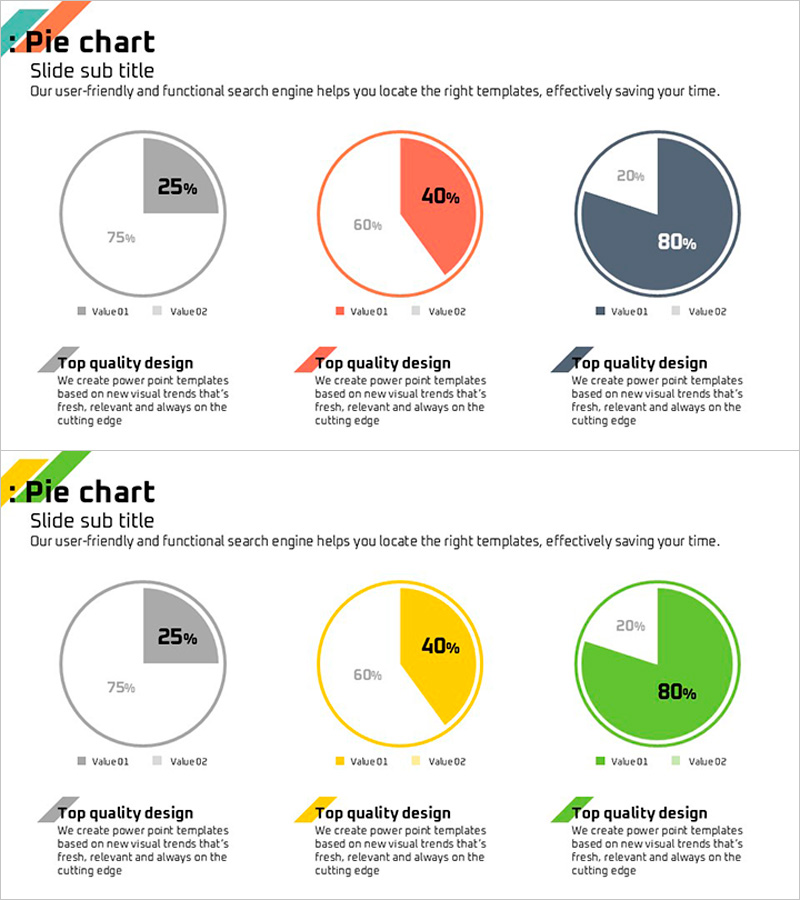
Essential pie chart PowerPoint slides for business data analysis, featuring a 2-slide set with three color schemes: gray, coral, and navy. Each circular chart supports two data series and includes percentage labels and legends for clear information delivery. Ideal for visualizing sales performance, customer distribution, budget allocation, and market share. The slides are ready to use in presentations and can be customized with your own data and color adjustments to match brand guidelines.
Usage Points
-
Main Usage
Visualize composition ratios, numerical comparisons, market share, and customer distribution using two-series pie charts. Percentage labels and legends maximize information clarity and support data-driven business insights.
-
How to Use
Apply to sales reports, budget breakdowns, customer segmentation, and market analysis presentations. Edit the values and labels on each slide to input your actual data, and adjust color schemes to align with your corporate branding standards.
-
Recommended For
Finance, marketing, sales, and executive professionals preparing quarterly reports, customer satisfaction surveys, product sales distribution, and organizational structure presentations.
-
Slide Structure
2-slide layout with one pie chart per slide supporting two data series each. Three distinct color schemes: gray, coral, and navy. Each chart includes percentage values and item legends for comprehensive data representation.
Related Products
-

Horizontal Bar Chart for Accident Status Visualization – Optimizing Data Comparison
#Market and Competitor Analysis #Graph #Other
-

Planterior Market Overview – Insights through Horizontal Bar Graph
#Market and Competitor Analysis #Graph #Market Overview
-

Fantastic Donut Chart – A Slide for Effective Market Analysis
#Market and Competitor Analysis #Financial Plans and Performance #Graph
-

The Road Presentation Radar Chart - Market Analysis and Strategy
#Market and Competitor Analysis #Marketing Plan and Strategy #Graph
