Visualizing Market Trends with Musician Comparison Graphs
RJ0500020_28
- Last Update 06/12/2025
- File Size 0.6MB
- # of Slides 2
- File Format PPTX
- Slide Ratio 16:9
- Color
Keywords
- #Content-Based Slides
- #Design-Based Slides
- #Market and Competitor Analysis
- #Diagram
- #Graph
- #Competitor Analysis
- #Competitive Advantage
- #Table
- #Column
- #Standard Table
- #Grouped Column
- #16:9
- #grouped column chart PowerPoint
- #dual series bar graph
- #market trend visualization slide
- #how to create grouped chart in PowerPoint
- #comparison chart template download
About the Product
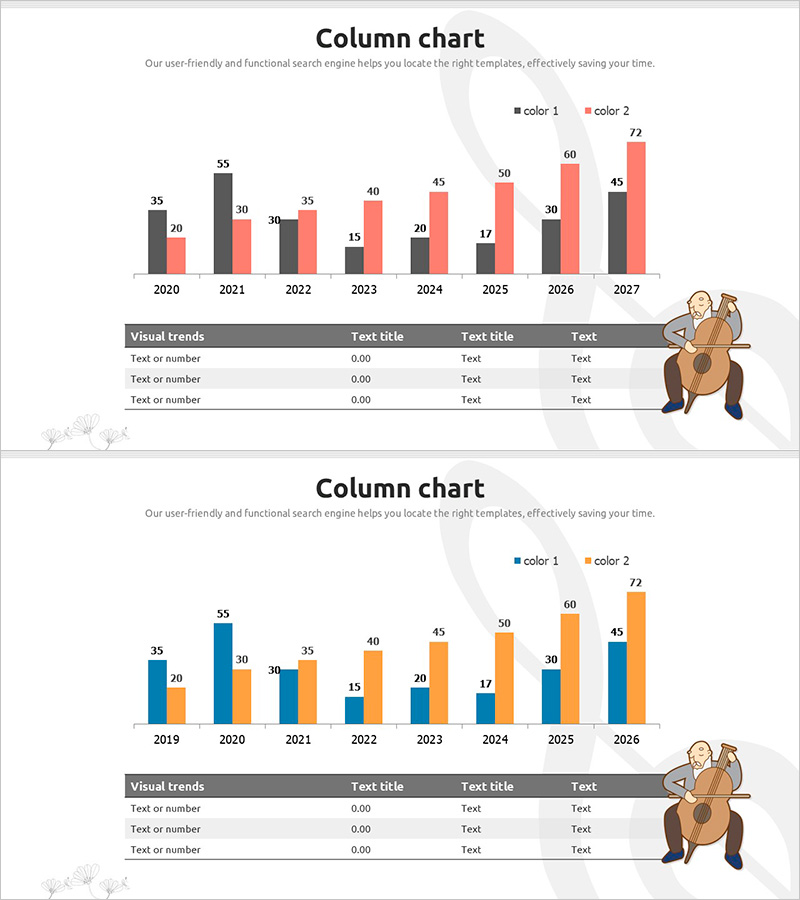
A grouped column chart PowerPoint slide comparing two data series across eight years from 2020 to 2027. The design uses dark gray and pink color schemes in a side-by-side bar structure to clearly visualize annual value changes. Each year displays two bars representing different metrics, making it ideal for competitive analysis, market share comparison, sales trend tracking, and business performance reporting. The Visual trends table at the bottom provides space for additional numerical data and insights, enabling immediate integration into presentations and business reports.
Usage Points
-
Main Usage
Simultaneously compare two metrics across multiple years to visualize market trends, competitive positioning, and performance changes. The grouped bar structure enables intuitive comparison of relative values, making it highly effective for executive reports, investor presentations, and strategic marketing briefings.
-
How to Use
Replace each bar value with your actual data points and update the color 1 and color 2 legend labels to match your metric names. Complete the Visual trends table below with year-over-year figures and key insights to strengthen data credibility. Colors can be adjusted to align with corporate branding guidelines.
-
Recommended For
Finance teams analyzing quarterly performance comparisons, marketing teams evaluating channel-specific results, sales teams tracking regional revenue trends, and executives preparing competitive benchmarking reports. Particularly suited for strategy meetings and board presentations emphasizing the relationship between two key indicators.
-
Slide Structure
Two-slide set: First slide features dark gray and pink grouped column chart (8 years × 2 bars per year); second slide uses blue and orange color scheme with identical structure. Each slide includes a Visual trends table (3 rows × 4 columns) below the chart for data entry.
Related Products
-

Competitiveness Table and Chart Analysis – Market and Competitor Analysis
#Market and Competitor Analysis #Diagram #Graph
-

Eco-friendly Icon Bar Graph Slide
#Market and Competitor Analysis #Diagram #Graph
-

Comparison of Group Results – Data Visualization
#Market and Competitor Analysis #Graph #Competitor Analysis
-

Competition Green Graph – Emphasizing Competitive Advantage
#Market and Competitor Analysis #Graph #Competitor Analysis
