Graph of Sharp Drop in Sales – Scenarios of Loss and Recovery
RJ0600011_6
- Last Update 06/23/2025
- File Size 0.8MB
- # of Slides 2
- File Format PPTX
- Slide Ratio 16:9
- Color
Keywords
About the Product
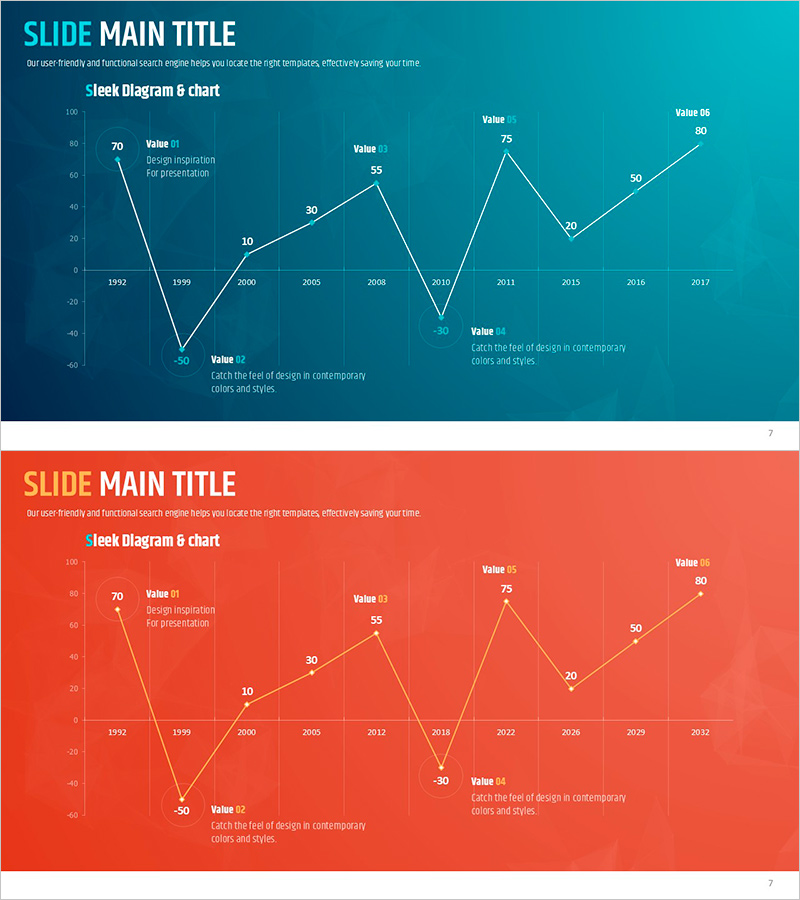
A 2-slide PowerPoint presentation featuring a line chart that visualizes sales decline and recovery scenarios from 1992 to 2017. Each data point is labeled with specific values and descriptive text, clearly showing loss periods and recovery trends. Available in two color versions—teal and coral—allowing you to match your presentation theme and corporate branding. Ideal for financial reports, business plans, and performance analysis presentations where sales volatility and recovery strategies need clear visual communication.
Usage Points
-
Main Usage
Visualize sales performance changes, loss periods, and recovery trajectories using a line chart format. Each data point includes numerical values and explanatory text to enhance audience comprehension of financial outcomes and future projections.
-
How to Use
Apply to the sales performance section of financial reports, performance analysis pages in business plans, and past performance or recovery strategy explanations in investor pitch decks. Select the color version that best matches your corporate branding or presentation theme.
-
Recommended For
CFOs and finance managers, business development managers, investor relations professionals, and executive presenters explaining sales volatility and recovery strategies. Suitable for quarterly or annual earnings presentations and crisis recovery case study presentations.
-
Slide Structure
2-slide set. Each slide contains a line chart representing 1992–2017 data with approximately 10 data points, value labels at key positions, and descriptive text boxes for loss and recovery periods. Teal version features a dark background; coral version uses a light background for visual contrast.
Related Products
-

Line Graph Analysis of Textile Market – Gain Competitive Edge
#Market and Competitor Analysis #Financial Plans and Performance #Graph
-

Highlighted Curved Graph for Market Analysis
#Market and Competitor Analysis #Financial Plans and Performance #Graph
-

Real Estate Upside Down Chart – Visualizing Market Trends
#Market and Competitor Analysis #Financial Plans and Performance #Graph
-

An Analysis of the Low Sales Section of Coffee – Graph Visualizing Sales and Performance
#Financial Plans and Performance #Risk Management and Regulatory Compliance #Graph
