Skill Graph for Performance Visualization – Vision and Growth
RJ0600011_12
- Last Update 06/23/2025
- File Size 1.1MB
- # of Slides 2
- File Format PPTX
- Slide Ratio 16:9
- Color
Keywords
- #Content-Based Slides
- #Design-Based Slides
- #Company Introduction
- #Product/Service Introduction
- #Graph
- #Other
- #Key Achievements
- #Development Status
- #Horizontal Bar
- #Segmented Horizontal Bar
- #16:9
- #horizontal bar chart PowerPoint
- #skill assessment presentation
- #competency comparison slide
- #performance visualization PPT
- #pie chart and bar graph combination
- #comparative analysis slide template
About the Product
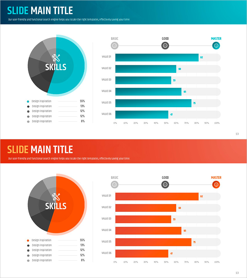
A horizontal bar chart PowerPoint slide that visually represents organizational competencies and performance metrics. The left side features a pie chart showing competency composition across five categories, while the right side displays a horizontal bar graph comparing six performance values across three proficiency levels: BASIC, GOOD, and MASTER. Two color versions are provided—teal and orange—allowing you to match your presentation style. The slide deck includes 2 slides optimized for 16:9 widescreen format. Perfect for company introductions, product presentations, performance reports, and business development meetings where data-driven competency assessment is essential.
Usage Points
-
Main Usage
Quantitatively compare organizational competencies, individual skills, or product performance while clearly communicating evaluation levels. The pie chart provides an overview of overall composition, while the bar graph displays item-by-item performance across proficiency tiers, enhancing audience comprehension.
-
How to Use
Use in company introduction presentations to showcase organizational strengths, in product presentations to compare feature performance, and in performance reports to evaluate team capabilities. Simply edit the text and numerical values to reflect your actual data.
-
Recommended For
Executives, marketing teams, sales professionals, HR specialists, and consultants who need to explain organizational capabilities or performance metrics quantitatively. Particularly effective when emphasizing comparative analysis and evaluation results visually.
-
Slide Structure
Slide 1: Teal background version – Left side: 5-segment pie chart (55%, 19%, 12%, 12%, 2%); Right side: 6-item horizontal bar graph with values ranging from 27 to 82, marked with BASIC, GOOD, and MASTER levels. Slide 2: Orange background version with identical layout and color variation. Total 2 slides, 16:9 aspect ratio, PPTX format.
Related Products
-

User Analysis Status by Year – Growth and Change
#Product/Service Introduction #Market and Competitor Analysis #Graph
-

Camera Shooting App Analysis Graph – Visualization and Insights
#Product/Service Introduction #Market and Competitor Analysis #Graph
-

Doughnut Chart for Visualizing Key Achievements – Quality Presentation
#Company Introduction #Product/Service Introduction #Graph
-

Development Status Analysis Notebook Diagram – Effective Data Visualization
#Product/Service Introduction #Diagram #Other
