User Analysis Status by Year – Growth and Change
RJ0400061_21
- Last Update 06/03/2025
- File Size 1.4MB
- # of Slides 2
- File Format PPTX
- Slide Ratio 16:9
- Color
Keywords
- #Content-Based Slides
- #Design-Based Slides
- #Product/Service Introduction
- #Market and Competitor Analysis
- #Graph
- #Other
- #Development Status
- #Customer Analysis
- #Horizontal Bar
- #Segmented Horizontal Bar
- #16:9
- #horizontal bar chart PowerPoint
- #user analysis by year slide
- #PowerPoint data visualization
- #year-over-year trend presentation
- #how to create bar chart in PowerPoint
About the Product
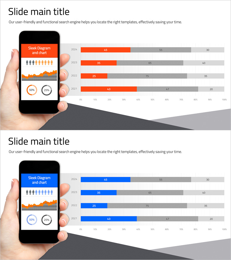
A horizontal bar chart PowerPoint slide that visualizes year-over-year user analysis data from 2024 to 2021. The orange bars represent primary metrics while gray background bars show comparative benchmarks or targets. A mobile device mockup is integrated with pie charts (50%, 25% ratio) to display user composition percentages at a glance. This 16:9 widescreen 2-slide template is ready to use in marketing reports, business performance reviews, quarterly analysis presentations, and investor pitch decks. All data values and labels are fully editable to match your specific metrics.
Usage Points
-
Main Usage
Visualize year-over-year user growth and change patterns using horizontal bar charts to communicate trends intuitively. Ideal for comparing user metrics, market share changes, and performance growth across multiple years.
-
How to Use
Use in marketing performance reports, quarterly and annual business reviews, investor presentations to demonstrate growth trajectory, and team meetings for KPI updates. Simply edit the bar lengths and numerical values with your own data for immediate deployment.
-
Recommended For
Marketing managers, business analysts, executives, and data teams presenting quarterly or annual performance metrics. Suitable for startup growth story pitches, corporate market analysis, and academic presentations of statistical data.
-
Slide Structure
Slide 1: Mobile device mockup with 4-year horizontal bar chart (2024, 2023, 2022, 2021). Orange bars for primary metrics and gray bars for comparative data. Pie charts (50%, 25%) below showing user composition. Slide 2: Identical layout with blue-toned horizontal bars as color variant. Both slides include editable data labels and percentage indicators.
Related Products
-

Horizontal Bar Charts for Customer Analysis – Summer Vacation Template
#Market and Competitor Analysis #Graph #Other
-

Camera Shooting App Analysis Graph – Visualization and Insights
#Product/Service Introduction #Market and Competitor Analysis #Graph
-

Internet of Things User Analysis Status – Customer Insights and Data Visualization
#Product/Service Introduction #Market and Competitor Analysis #Graph
-

People Silhouette and Comparison Graph – Data Visualization for Customer Analysis
#Market and Competitor Analysis #Graph #Other
