Red-Blue Stereoscopic Pie Charts – Performance Visualization
RJ0600010_5
- Last Update 06/23/2025
- File Size 0.3MB
- # of Slides 2
- File Format PPTX
- Slide Ratio 16:9
- Color
Keywords
- #Content-Based Slides
- #Design-Based Slides
- #Company Introduction
- #Market and Competitor Analysis
- #Diagram
- #Graph
- #Key Achievements
- #Market Share
- #Table
- #Circles
- #Standard Table
- #Pie Chart
- #16:9
- #pie chart PowerPoint slide
- #3D pie graph presentation
- #ratio visualization template
- #performance data chart
- #market share slide download
About the Product
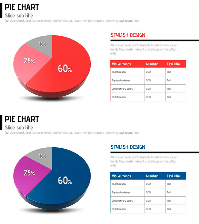
A stereoscopic pie chart PowerPoint slide that visualizes the ratio of three data segments with striking red and blue color contrast. The 3D effect emphasizes key performance metrics and market share distribution (60%, 25%, 15%), while an accompanying data table on the right provides numerical details. This presentation slide template is ready to use for company overviews, market analysis reports, and performance presentations. The 2-slide set includes both red and blue color variations, allowing you to match your presentation's visual tone and maintain design consistency across your deck.
Usage Points
-
Main Usage
Visualizes three-part ratio data such as company performance metrics, market share distribution, or revenue composition using a 3D pie chart. The contrasting red and blue colors clearly differentiate each segment, while the accompanying data table reinforces numerical information for enhanced audience comprehension.
-
How to Use
Apply this slide in company overview presentations (performance section), market analysis reports (market share comparison), quarterly earnings presentations, and investor pitch decks. The 2-slide set provides both red and blue versions, so you can select the version that best matches your presentation's background color and overall design theme.
-
Recommended For
Recommended for business executives, marketing professionals, financial analysts, and consultants preparing executive reports, investor relations materials, marketing strategy documents, quarterly performance reviews, and market research presentations. Particularly effective for data-driven B2B presentations that require clear visual emphasis on key metrics.
-
Slide Structure
Each slide features a 3D pie chart on the left (displaying 60%, 25%, and 15% segments) paired with a 4-row, 3-column data table on the right (columns: Visual trends, Number, Text title). The first slide uses red color tones while the second uses blue tones, maintaining consistent layout structure for professional presentation flow.
Related Products
-

Three Key Performance Pie Charts – Visualization of Performance Analysis
#Company Introduction #Market and Competitor Analysis #Graph
-

Pie Chart and Table Metrics – Market Share Analysis
#Market and Competitor Analysis #Financial Plans and Performance #Diagram
-

Square Frame Presentation Template – Pie Chart & Table
#Market and Competitor Analysis #Financial Plans and Performance #Diagram
-

Internet Shopping Market Analysis Chart
#Product/Service Introduction #Market and Competitor Analysis #Diagram
