Segment Bar Graphs and Analyses – Data Insights
RJ0600089_14
- Last Update 07/14/2025
- File Size 0.6MB
- # of Slides 2
- File Format PPTX
- Slide Ratio 16:9
- Color
Keywords
About the Product
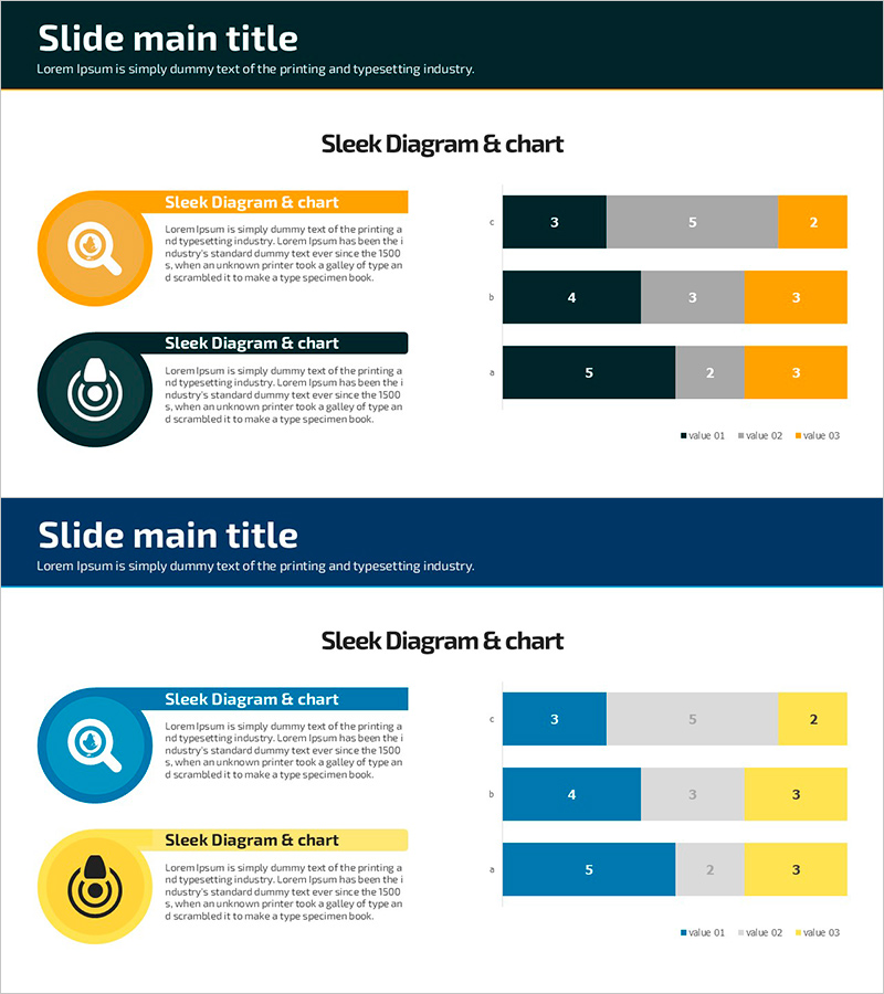
A PowerPoint slide template featuring horizontal bar graphs that visualize 3 data series side by side. The design uses a professional color palette of dark navy, orange, and gray tones, making it ideal for business presentations. Each slide includes circular icons and text description areas to effectively communicate data insights. With 2 slides ready to use, this template is perfect for marketing reports, sales performance analysis, and strategic presentations. All elements are fully editable in PPTX format, allowing you to customize colors, fonts, and data values to match your brand.
Usage Points
-
Main Usage
Designed to compare three or more data series simultaneously and visualize ranking, performance, and numerical differences. Ideal for marketing performance analysis, sales results comparison, product benchmarking, and quantitative data-driven decision-making presentations.
-
How to Use
Adjust bar lengths to input actual data values and modify legend and axis labels accordingly. Add category names or department titles in the circular icon areas, and insert analysis text in the text boxes. Customize colors and fonts to match your corporate branding guidelines.
-
Recommended For
Marketing, sales, finance, and strategy professionals preparing quarterly or annual performance reports. Suitable for product sales comparison, regional performance analysis, competitive benchmarking, budget execution status, and any business presentation requiring multi-item numerical comparison.
-
Slide Structure
2-slide layout with each slide divided into left circular icon area (orange and dark navy) and right horizontal bar graph section. Bars are color-coded in 3 series (dark navy, gray, orange), displaying 5 data points per row. Title area at top and legend at bottom right for clear data interpretation.
Related Products
-

User Analysis Graph by Age Group – Advanced Data Insights
#Market and Competitor Analysis #Diagram #Graph
-

Technology Service Market Trends and Status – 100% Stacked Bar Chart
#Market and Competitor Analysis #Graph #Market Status
-

Pie Chart for Oriental Medicines Market Overview
#Market and Competitor Analysis #Graph #Market Status
-

Hourly Pie Chart Slide – Progress and Planning
#Business Management #Graph #Implementation Schedule
