Market Share Pie Chart – Visualized in Blue and Green
RJ0600005_9
- Last Update 06/22/2025
- File Size 2.6MB
- # of Slides 2
- File Format PPTX
- Slide Ratio 16:9
- Color
Keywords
About the Product
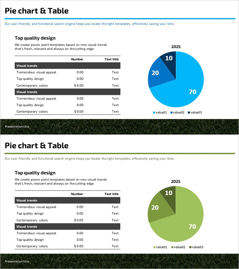
A professional PowerPoint slide combining a pie chart and data table for comparing market share and key metrics at a glance. The 3-segment pie chart in blue and green tones visualizes proportional data with precision, while the left-side table presents numerical values clearly. This 2-slide set is ready to use for competitive analysis, market research presentations, sales performance reports, and data-driven business meetings. Designed in 16:9 widescreen format for seamless compatibility with modern projectors and displays.
Usage Points
-
Main Usage
Effectively communicates proportional relationships such as market share, sales distribution, and customer composition. The 3-segment pie chart (70%, 20%, 10%) intuitively shows the relative size of major and minor categories, while the accompanying table provides specific numerical values and category labels for comprehensive data understanding.
-
How to Use
Ideal for executive reports, business plan presentations, marketing strategy meetings, and quarterly performance reviews. Simply replace the table values with your actual data and adjust the pie chart segments and colors to match your presentation content. The layout supports quick customization without design expertise.
-
Recommended For
Finance teams, marketing departments, sales teams, and executives who rely on data-driven decision-making. Particularly effective for explaining market analysis, competitive benchmarking, sales performance, customer segmentation, and budget allocation.
-
Slide Structure
Both slides feature identical layouts with a data table on the left (3 rows × 3 columns with headers: Number, Text title, and category rows) and a pie chart on the right displaying 2025 data. The pie chart contains three segments labeled value01 (70%), value02 (20%), and value03 (10%) in distinct blue and green shades. A title area appears at the top and a presentation footer bar at the bottom.
Related Products
-

Performance Analysis Pie Chart – Market Share Visualization
#Market and Competitor Analysis #Diagram #Graph
-

Neuroscience Topic Analysis and Pie Charts – Market Share Visualization
#Market and Competitor Analysis #Diagram #Graph
-

Modern Blue Pie Chart Template – Market Share Analysis
#Market and Competitor Analysis #Diagram #Graph
-

Analyzing Market Share with 3 Donut Charts and Tables
#Market and Competitor Analysis #Diagram #Graph
