Comparison of Services from Other Brands – Identifying Competitive Advantages
RJ0600005_13
- Last Update 06/22/2025
- File Size 2.6MB
- # of Slides 2
- File Format PPTX
- Slide Ratio 16:9
- Color
Keywords
About the Product
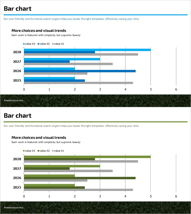
A grouped horizontal bar chart PowerPoint slide designed to compare your services against competitors and identify competitive advantages at a glance. This 2-slide presentation template displays 4 items across 3 data series (value 03, value 02, value 01) for comprehensive comparative analysis. The blue and gray color scheme provides clear visual distinction between data series, making performance differences intuitive and easy to understand. Ideal for business presentations including competitive analysis, market positioning, and product performance benchmarking.
Usage Points
-
Main Usage
Demonstrates quantitative comparison between competitor services and your own offerings to establish competitive advantage. The grouped format allows simultaneous display of 3 metrics across 4 items, making it highly effective for complex data comparison. Persuasively communicates your market position to investors, clients, and internal teams.
-
How to Use
Modify bar lengths to input your actual numerical data. Replace legend labels (value 03, value 02, value 01) with your own metric names. Edit item names and time periods as needed. Insert into the competitive analysis, product comparison, or performance review section of your presentation to strengthen data-driven arguments.
-
Recommended For
Marketing, sales, and strategy professionals creating competitive analysis materials. Recommended for investor pitch decks, product launch presentations, and market entry reports where competitive positioning must be explained. Suitable for consulting, research, and business development teams presenting analytical findings.
-
Slide Structure
2-slide template with identical grouped horizontal bar chart layout. Each slide displays 4 items (2028, 2027, 2026, 2025) on the Y-axis and 3 data series as grouped bars along the X-axis (0–6 range). Blue and gray colors distinguish data series, while gridlines facilitate accurate value reading.
Related Products
-

Travel Horizontal Bar Bundled Graph – Market Trends and Competitive Advantage
#Market and Competitor Analysis #Graph #Industry Trends
-

Highlight Graph and Analytical Text – Emphasizing Results and Competitive Advantage
#Company Introduction #Market and Competitor Analysis #Graph
-

Slide Emphasizing Social Service Strengths through Competitive Analysis
#Market and Competitor Analysis #Graph #Text Box
-

Circular Gradient Wide Template Bar for Visualizing Performance
#Business Strategy #Market and Competitor Analysis #Graph
