Graphs that draw a successful future outlook – Visualizing Market Trends
RJ0300052_8
- Last Update 05/02/2025
- File Size 4.4MB
- # of Slides 2
- File Format PPTX
- Slide Ratio 16:9
- Color
Keywords
- #Content-Based Slides
- #Design-Based Slides
- #Market and Competitor Analysis
- #Graph
- #Other
- #Future Outlook
- #Industry Trends
- #Column
- #Column Chart
- #Silhouette
- #16:9
- #horizontal bar chart PowerPoint
- #market trend visualization slide
- #business data comparison
- #5-item bar graph template
- #how to create bar chart in PowerPoint
About the Product
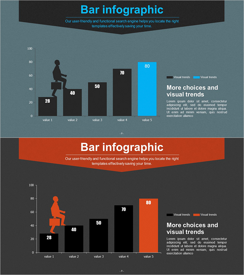
A professional horizontal bar chart PowerPoint slide designed to visualize business performance and market trends with clarity and impact. This 2-slide set features contrasting color schemes in cyan and orange tones, making data comparison immediately apparent. Each slide displays five data points represented as horizontal bars with numerical labels, complemented by silhouette business figures that enhance presentation credibility. Created in 16:9 widescreen format and delivered as fully editable PPTX files, these slides integrate seamlessly into modern business presentations. Ideal for quarterly performance reports, market analysis presentations, competitive benchmarking, investment pitches, and any data-driven business communication requiring clear numerical comparison.
Usage Points
-
Main Usage
Effectively communicate comparative data across five categories using horizontal bar representation, allowing viewers to instantly grasp relative magnitudes. The contrasting cyan and orange color palette distinguishes data series, while integrated silhouette business figures reinforce professional context and audience engagement.
-
How to Use
Deploy in executive dashboards, quarterly earnings presentations, market research reports, and investor briefings where numerical comparison is essential. Customize bar lengths and colors to match your actual data, edit titles and legends to reflect your specific metrics, and modify accompanying text to align with your presentation narrative.
-
Recommended For
Marketing managers, financial analysts, business development professionals, management consultants, and data-driven decision makers. Particularly effective for quarterly performance reviews, market research findings, competitive analysis documentation, and strategic planning presentations.
-
Slide Structure
Two-slide set with each slide containing a 5-item horizontal bar chart. First slide uses cyan color palette; second slide features orange tones for visual variety. Left-aligned silhouette business figures provide visual balance. Y-axis ranges 0–100 with numerical labels on bars. Right side includes legend box and descriptive text area. Standard analytical chart layout optimized for executive communication.
Related Products
-

Exercise Ability Improvement Graph
#Business Strategy #Market and Competitor Analysis #Graph
-

Market Trends and Analysis Charts – Delivering Business Insights
#Business Strategy #Market and Competitor Analysis #Graph
-

Bar Graph Visualizing Elderly Population Ratio
#Market and Competitor Analysis #Graph #Other
-

Analysis of Modern Theme Market Trends – Valuable Insights
#Market and Competitor Analysis #Graph #Future Outlook
