Effectively Visualized Slide of Business Trends
RJ0500048_6
- Last Update 06/20/2025
- File Size 0.4MB
- # of Slides 2
- File Format PPTX
- Slide Ratio 16:9
- Color
Keywords
- #Content-Based Slides
- #Design-Based Slides
- #Business Introduction
- #Business Strategy
- #Diagram
- #Graph
- #Financial Outlook & Expected Impact
- #Table
- #Column
- #Standard Table
- #Segmented Column
- #16:9
- #vertical stacked bar chart PowerPoint
- #multi-series bar graph slide
- #business trends visualization
- #revenue forecast chart
- #data comparison slide template
- #business presentation slide
About the Product
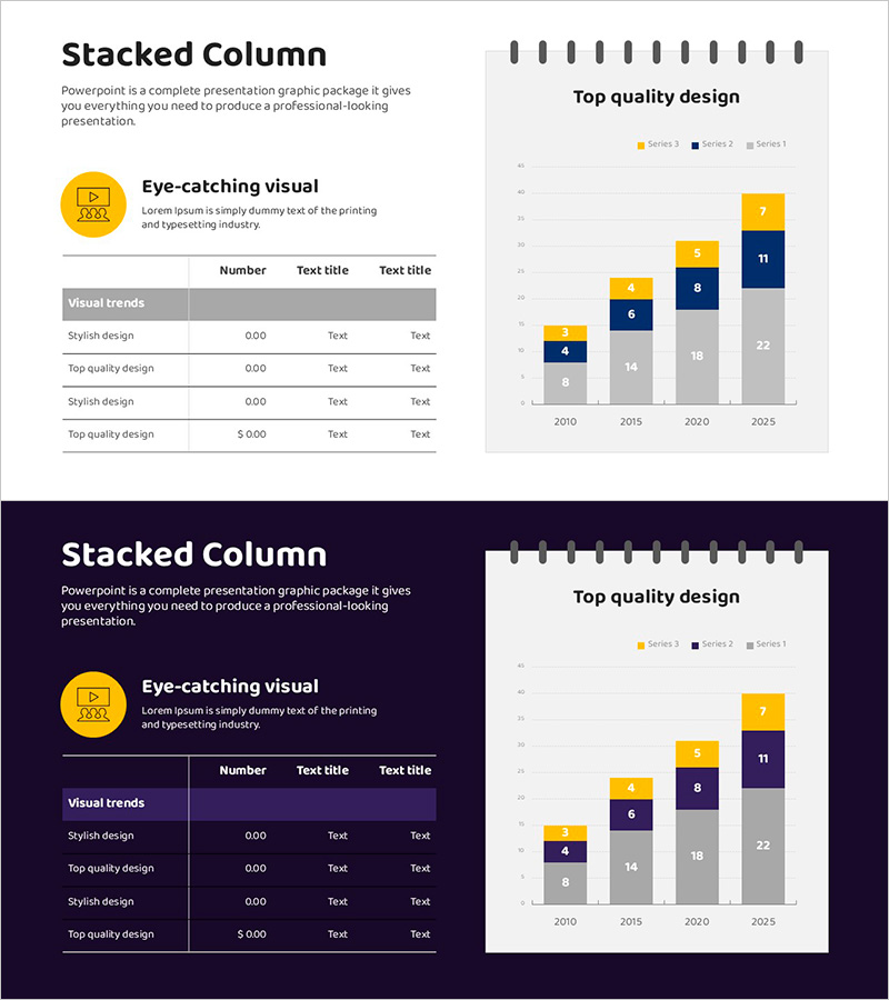
A professional PowerPoint slide featuring a vertical stacked bar chart that visualizes business trends and revenue forecasts across four data series from 2010 to 2025. The 2-slide template combines left-side icons and descriptive text with a right-side multi-series bar graph using gray, yellow, and navy color schemes. Each bar segment represents a distinct business category, allowing viewers to compare both individual performance and total aggregate values at a glance. The design is optimized for executive presentations, business plans, and investor pitch decks. Fully editable PPTX format enables quick customization of data values, labels, and color schemes.
Usage Points
-
Main Usage
Effectively communicate year-over-year business performance and revenue projections through quantitative comparison. The stacked bar format simultaneously displays absolute values and compositional ratios across four business categories, making it essential for executive dashboards, strategic business plans, and investor relations materials.
-
How to Use
Replace left-side icons with your business unit names (e.g., Product A, Product B, Product C, Product D). Update the graph data values with actual figures by clicking on the chart and editing the data table. Adjust colors independently for each series, extend or compress the year range, and modify legend and axis labels to match your presentation context.
-
Recommended For
CFOs, financial analysts, business development teams, and executives presenting quarterly or annual performance reviews. Particularly valuable when proposing new initiatives and need to juxtapose historical performance data with future targets to strengthen business cases.
-
Slide Structure
Slide 1: Title area + 4 left-side icons + right-side vertical stacked bar chart (2010–2025, 4 data series). Slide 2: Alternative layout variant. Chart uses gray baseline with yellow, navy, and accent colors to differentiate series; cumulative bar height represents total business scale per year.
Related Products
-

Travel Business Trends and Future Prospects - Strategies for Revenue Growth
#Business Introduction #Business Strategy #Graph
-

Financial Status Analysis Chart – Business Introduction and Future Insights
#Business Introduction #Market and Competitor Analysis #Diagram
-

Business Proposal Contract Featuring Company Introduction and Overview
#Company Introduction #Business Introduction #Business Vision and Strategy
-

Horizontal Bar Chart for Skincare Market Sales Status
#Business Strategy #Financial Plans and Performance #Graph
