Effective Slide for Visualizing Business Progress with Segmentation Chart
RJ0500047_9
- Last Update 06/20/2025
- File Size 0.2MB
- # of Slides 2
- File Format PPTX
- Slide Ratio 16:9
- Color
Keywords
- #Content-Based Slides
- #Design-Based Slides
- #Business Introduction
- #Business Strategy
- #Graph
- #Horizontal Bar
- #Segmented Horizontal Bar
- #Project Progress
- #16:9
- #horizontal bar chart PowerPoint
- #year-over-year comparison slide
- #business progress visualization
- #bar graph template
- #data visualization PPT slide
About the Product
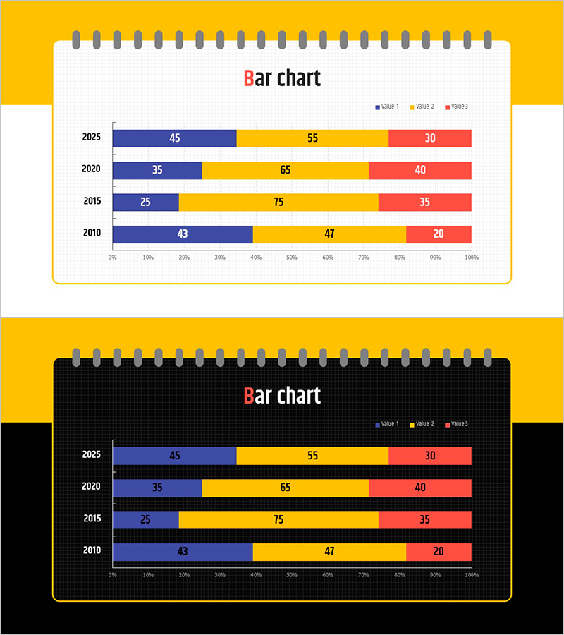
A PowerPoint slide that visualizes business progress across multiple years using a horizontal bar chart with 4 data series. The slide displays data from 2010 to 2025 across 5 key years, with each bar divided into 3 values (VALUE1, VALUE2, VALUE3) for detailed comparison. Numeric labels are embedded directly on each bar segment for precise data reading. Two design variations are included: a light background standard version and a dark background high-contrast version, allowing you to match your presentation environment and document style. This slide is optimized for comparing time-series data such as business performance trends, annual progress tracking, and goal achievement metrics.
Usage Points
-
Main Usage
This slide enables quick visual comparison of business performance trends, progress metrics, and goal achievement across multiple years. The side-by-side bar arrangement allows viewers to compare values within the same year and track changes over time simultaneously, making complex data easy to understand at a glance.
-
How to Use
Use this slide in business reports, executive performance presentations, and strategic planning meetings to communicate year-over-year progress data. Simply replace the sample values with your actual data, adjust the legend and axis labels as needed, and the slide is ready to present. The standard version works well for typical presentations, while the high-contrast version is ideal for low-light environments or projectors with limited brightness.
-
Recommended For
Business managers, executives, consultants, and marketing teams analyzing annual performance, reporting project progress, and conducting comparative analysis. Particularly effective for project management tracking, sales performance reporting, financial results presentation, and multi-metric KPI dashboards where several indicators must be monitored simultaneously.
-
Slide Structure
The slide features a horizontal bar chart with 4 data series (VALUE1, VALUE2, VALUE3, plus legend). The Y-axis displays 4 years (2010, 2015, 2020, 2025), while the X-axis shows a 0–100% scale. Each bar segment displays its numeric value directly, and three distinct colors (blue, yellow, red) differentiate the data series for clear visual distinction.
Related Products
-

Bar Graph Analysis for Business Strategy – Market Diagnosis
#Business Strategy #Market and Competitor Analysis #Graph
-

Fantastic Wide Flow Chart – Strategic Roadmap for Business Development
#Business Introduction #Business Strategy #Diagram
-

Horizontal Bar Segmentation Graph for Market Trend Analysis – Establishing Business Strategy
#Business Strategy #Market and Competitor Analysis #Graph
-

Fantastic Wide PPT Vertical Bar Segmentation Chart – Visualization of Business Strategy
#Business Introduction #Business Strategy #Graph
