Learning Segmentation Graphs by Year – Business Strategy and Outcomes
RJ0500043_22
- Last Update 06/19/2025
- File Size 0.4MB
- # of Slides 2
- File Format PPTX
- Slide Ratio 16:9
- Color
Keywords
- #Content-Based Slides
- #Design-Based Slides
- #Business Strategy
- #Graph
- #Financial Outlook & Expected Impact
- #Achievements
- #Horizontal Bar
- #Segmented Horizontal Bar
- #16:9
- #horizontal bar chart PowerPoint
- #year-over-year comparison slide
- #segmentation graph presentation
- #business performance visualization
- #trend analysis slide template
About the Product
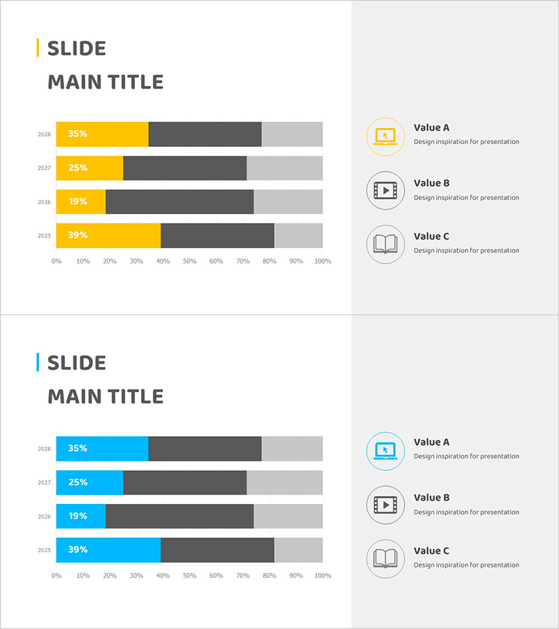
A horizontal bar chart PowerPoint slide that visualizes year-over-year data changes across four years (2025–2028) with clear numerical comparison and trend analysis. The design uses a three-color palette of yellow, dark gray, and light gray to distinguish data segments and highlight key metrics. This slide template is ideal for business strategy presentations, performance reports, and quarterly reviews where year-by-year segmentation of outcomes is essential. Two slide variations are included: one with yellow accent bars and one with blue accent bars, allowing you to select the version that best matches your presentation context and audience.
Usage Points
-
Main Usage
Designed to compare year-over-year business performance metrics numerically and communicate temporal trend changes with clarity. Ideal for executive briefings, business evaluation presentations, and strategic planning meetings where historical performance and future targets must be visualized simultaneously.
-
How to Use
Enter numerical values for each year row and the bar lengths adjust automatically. Use the yellow accent version to emphasize specific metrics; use the blue version for objective data representation. Customize legend labels and axis titles to match your document context and data categories.
-
Recommended For
Executives, business managers, and marketing teams presenting quarterly or annual performance reports. Suitable for any presentation scenario requiring time-series numerical data comparison, such as revenue trends, customer growth, market share, or project completion rates.
-
Slide Structure
Two-slide layout: Slide 1 features yellow accent bars (35%, 25%, 19%, 39%) representing 4-year trends with Value A, B, C icon legend on the right. Slide 2 uses identical structure with blue accent bars for color variation. Horizontal axis spans 0–100% with year labels (2025–2028) for clear temporal flow and data scale reference.
Related Products
-

Target Performance and Expected Results – Visualized with Vertical Bar Charts
#Business Strategy #Graph #Financial Outlook & Expected Impact
-

Graph of Future Development of Calligraphy – Revenue Projections and Expectations
#Business Strategy #Technical Approach #Graph
-

Flower Wide PPT Vertical Bar Graph – Performance and Expectations
#Business Strategy #Graph #Financial Outlook & Expected Impact
-

Aerobic Exercise System Diagram – Strategies for Effective Outcomes
#Product/Service Introduction #Business Strategy #Diagram
